How to read these slides?
 Overview
Click on the menu bar items to navigate to chapters
Click here for PDF versionNote: No videos in PDF version!

VU Visual Analytics
Visualization of Time Series
Julian Rakuschek
05.05.2026
Remark for the PDF Version:
This lecture contains many videos. If you want to see the videos, it is advisable to use the web version available at:
https://presentations.rakuschek.at/2026-05-05-va-time-series/Supplemental Textbook
Wolfgang Aigner • Silvia Miksch • Heidrun Schumann • Christian Tominski
Visualization of Time-Oriented Data
Revised and Expanded Second Edition, Springer, 2023
Available via open access at timeviz.net
The Chapters we will cover
- Historical Background
- Time & Time-Oriented Data
- Crafting Visualizations of Time-Oriented Data
- Involving the Human via Interaction
Additionally, we will see a selection of fundamental time series visualizations (Chapter 7 and Appendix A in the book).
Throughout the lecture we are also going beyond the book by showing recent research results.
Acknowledgment
- Most graphics in this lecture are copied from the book.
- This is only possible by the relentless effort of the authors to publish their work using the CC BY license.
- Publishing open access in this way is a shining example of free and open teaching.
- Graphics used from the book will be indicated as
Aigner, Miksch, Schumann, Tominski (2023)
together with the original source if applicable. - We thank the authors for their hard work! 💙
What are time series?
Definition

Traditional data
Measurements of exactly the same thing
Time series data
Measurements over time
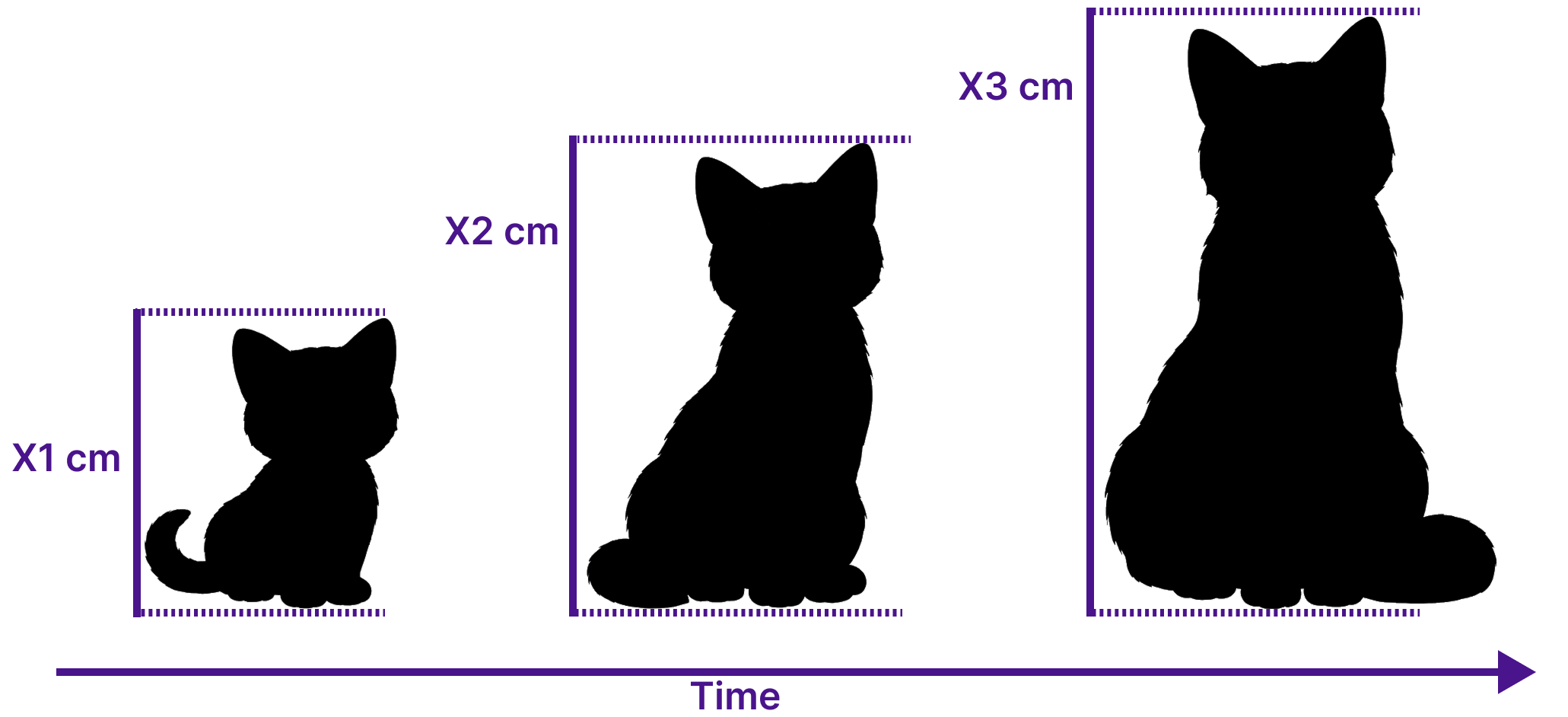
Univariate Time Series Data
- One measurement of one entity at every time step
- Ordered vector $\mathbf{x} \in \mathbb{R}^n$, $\mathbf{x} = [x_1, x_2, \ldots, x_n]$
- Measurement interval is often constant, but not always
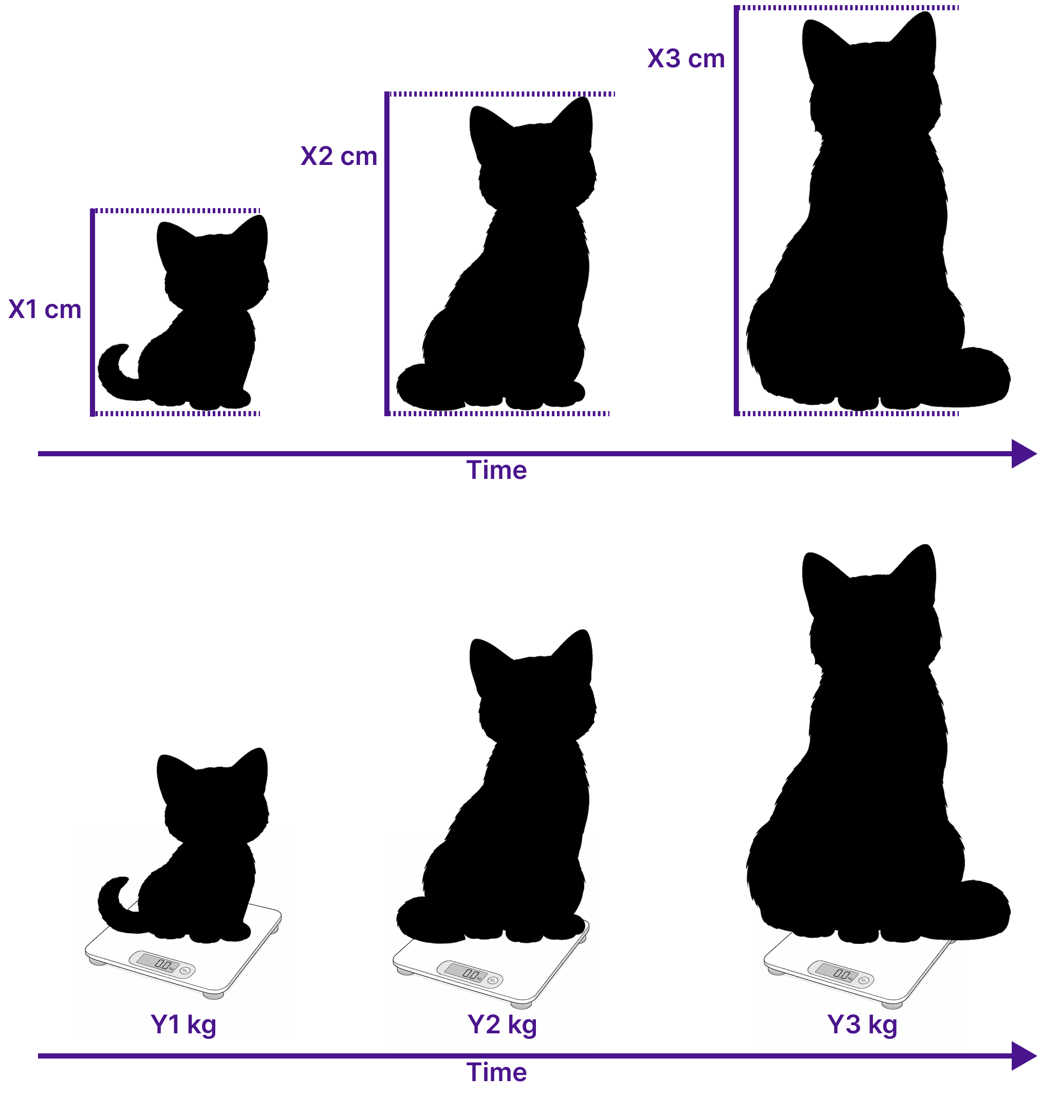
Multivariate Time Series Data
- Many measurement of one entity at every time step
- Matrix $\mathbf{X} \in \mathbb{R}^{d \times n}$, $\mathbf{X} = [X_1, X_2, \ldots, X_n]$
- Each $X_t \in \mathbf{X}$ is a vector $X_t = [X_{t,1}, \ldots, X_{t,d}]^T$
Examples
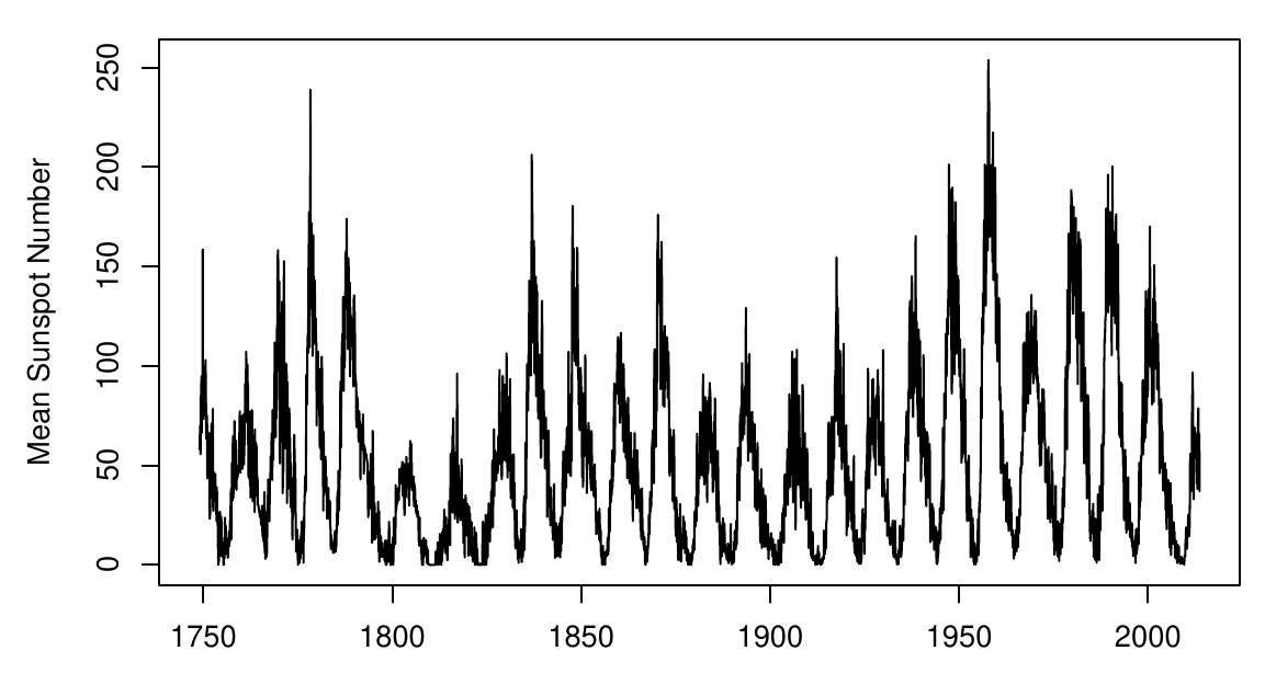
Univariate
Sunspot counts (monthly)
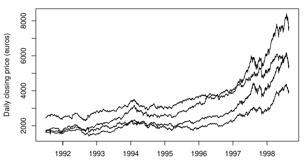
Multivariate
EU stock market prices (daily)
A brief historical detour
Not relevant for the exam!
10th/11th century
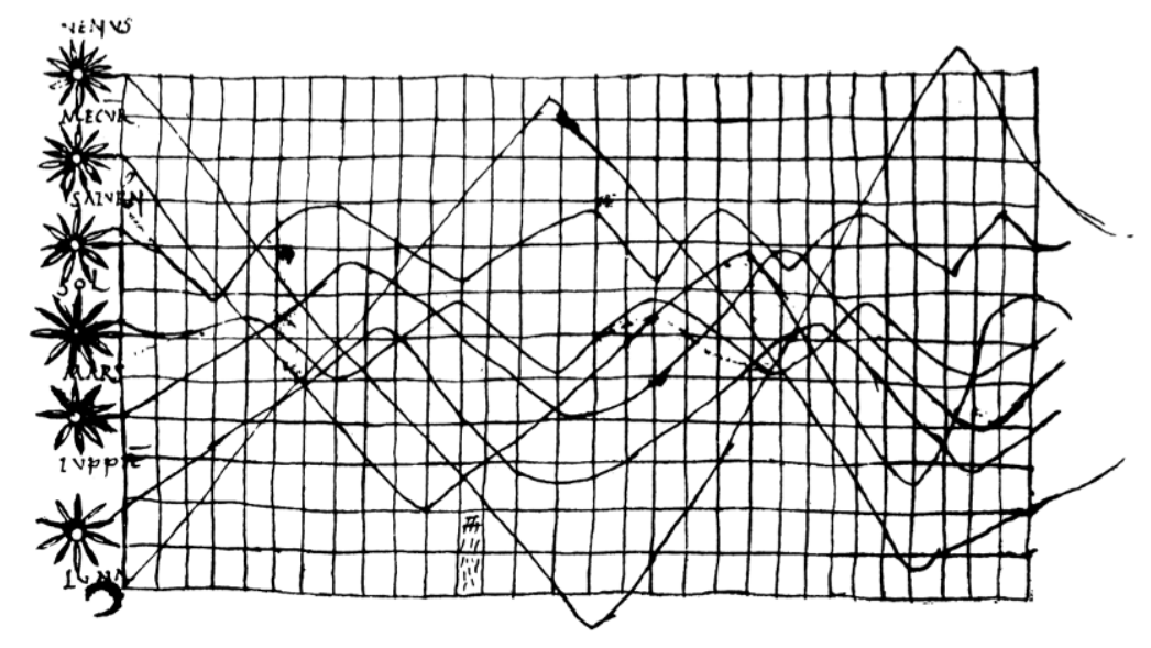
Inclinations of the planetary orbits as a function of time.
Probably the oldest time-series representation to be found in literature.
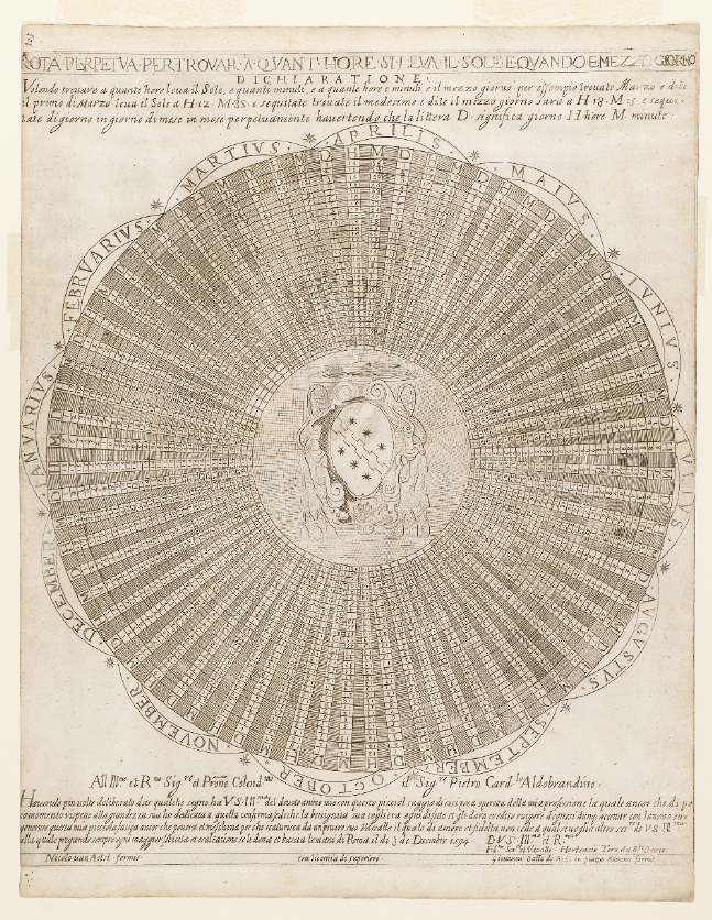
1594
Gregorian calendar designed for a 400-year cycle.
1765
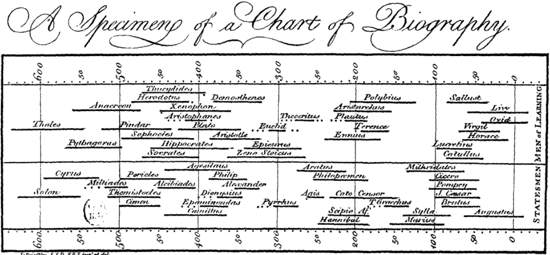
Figure source: Aigner, Miksch, Schumann, Tominski (2023, p.23), retrieved from Wikimedia Commons, citing Joseph Priestley (1765).
- Chart of biography by Joseph Priestley.
- Two groups of Statesmen and Men of Learning.
- Visualizing intervals of time using lines not obvious!
- He devoted four pages of text to describe and justify his technique to his readers.
- Also includes temporal uncertainties.
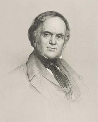
William Playfair (1759–1823)
- Founding father of modern statistical graphs
- pie charts
- silhouette graphs
- bar graphs
- line plots
- Famous Work: Commercial and Political Atlas
- Contains the first versions of classic line charts we know today.
1786
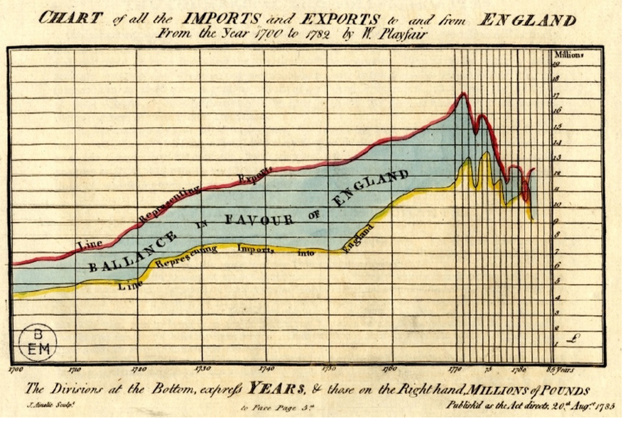
Figure source: Aigner, Miksch, Schumann, Tominski (2023, p.21), retrieved from Wikimedia Commons, citing Playfair and Corry (1786).
- Playfair and Corry
- imports and exports of England from 1700 to 1782
- yellow = imports
- red = exports
1805
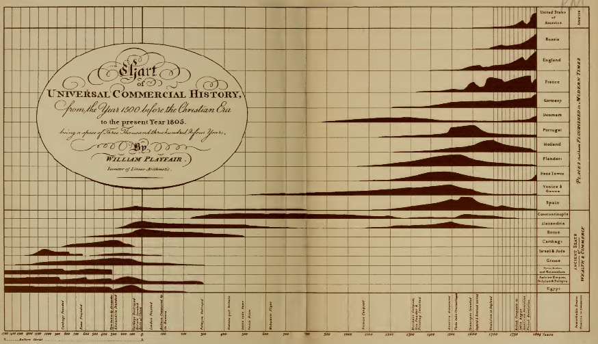
Figure source: Aigner, Miksch, Schumann, Tominski (2023, p.21), retrieved from Wikimedia Commons, citing Playfair (1805).
- Silhouette graph by Playfair
- Rise and fall of nations over a period of more than 3000 years.
1821
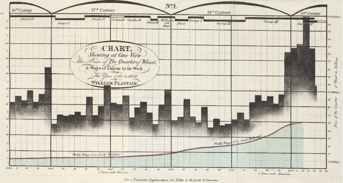
Figure source: Aigner, Miksch, Schumann, Tominski (2023, p.22), retrieved from Wikimedia Commons, citing Playfair (1821).
- Information rich chart by Playfair
- Weekly wages of a good mechanic (line)
- Price of a quarter of wheat (bars)
- Historical context (timeline at the top)
Time series visualizations are important to solve real-world problems!
1858
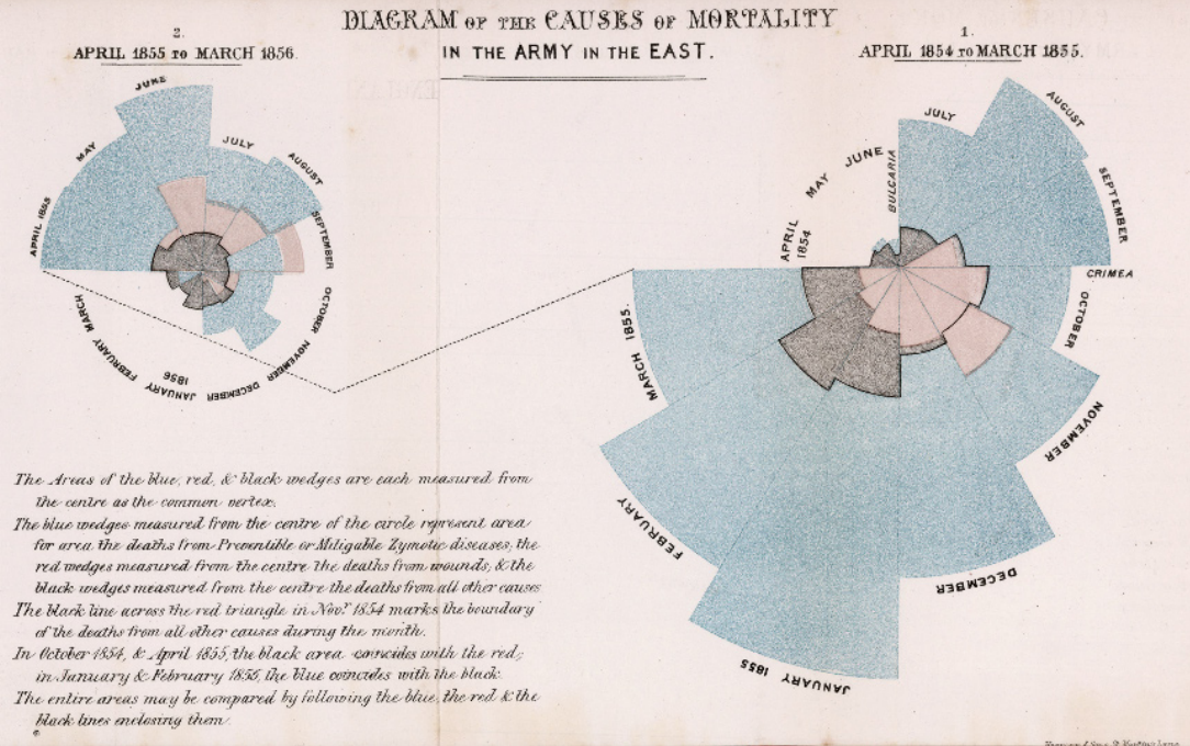
Figure source: Aigner, Miksch, Schumann, Tominski (2023, p.29), retrieved from Wikimedia Commons, citing Nightingale (1858).
- Rose charts by Florence Nightingale
- Number of casualties and causes of death in the Crimean War
- Colors:
- Red = Wounds
- Black = Accidents and other causes
- Blue = Preventable diseases
- Right = No hygiene measures
- Left = With hygiene measures
Nightingale successfully used a visualization to convince others of the pressing problem!
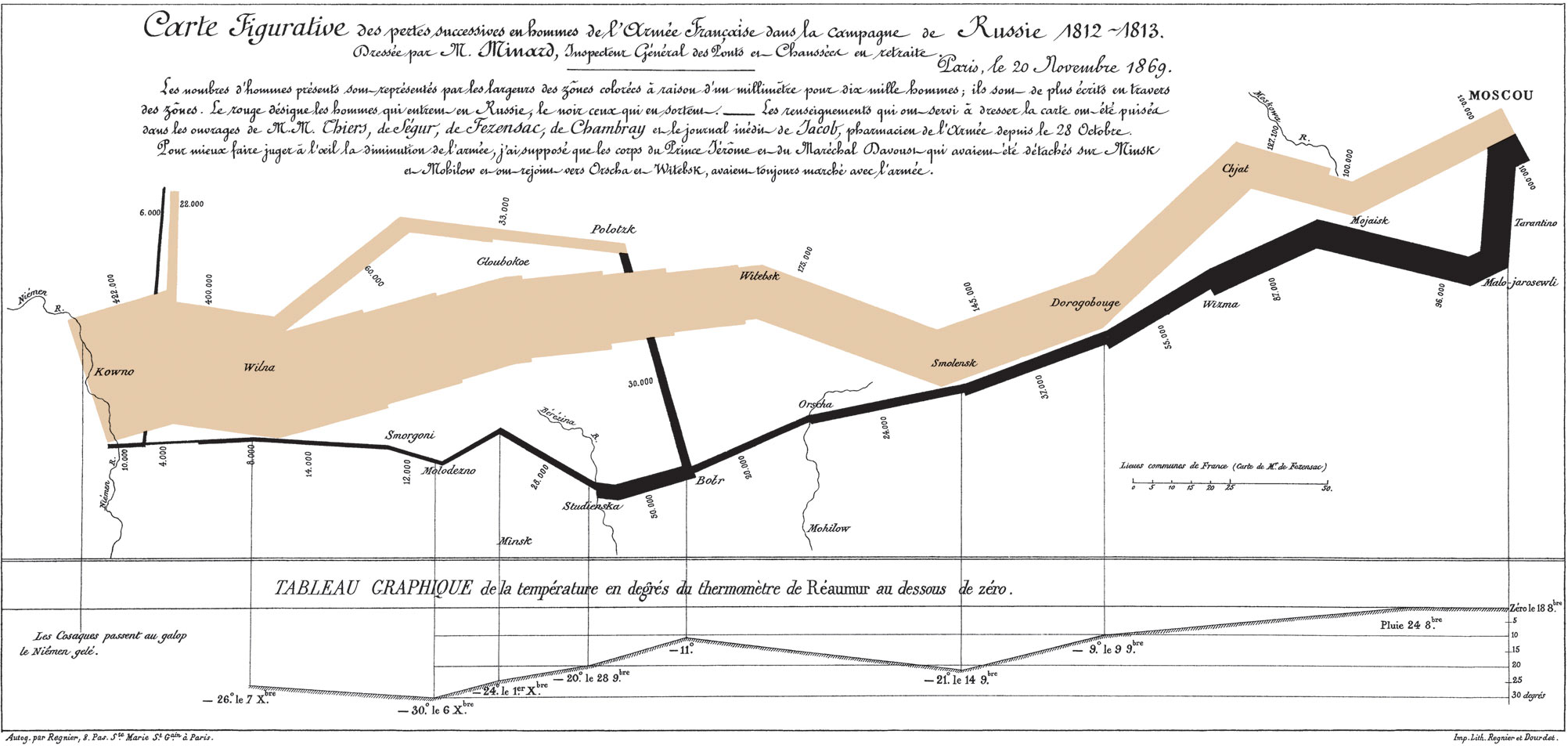
But what about data characteristics linked to space?
1869
Napoleon’s Russian campaign of 1812 by Charles Joseph Minard
Figure source: Aigner, Miksch, Schumann, Tominski (2023, p.27), retrieved from Wikimedia Commons, citing Minard (1869).
In the following years, several other domains benefited from time series visualizations.
1875
Train schedule by Étienne-Jules Marey.
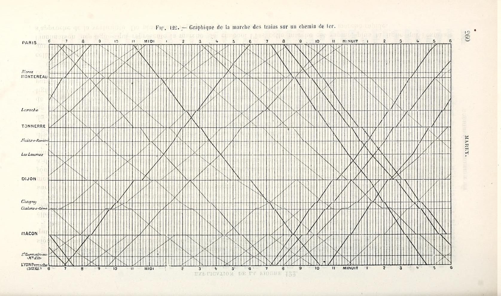
Figure source: Aigner, Miksch, Schumann, Tominski (2023, p.37), retrieved from Internet Archive, citing Marey (1875).
1898
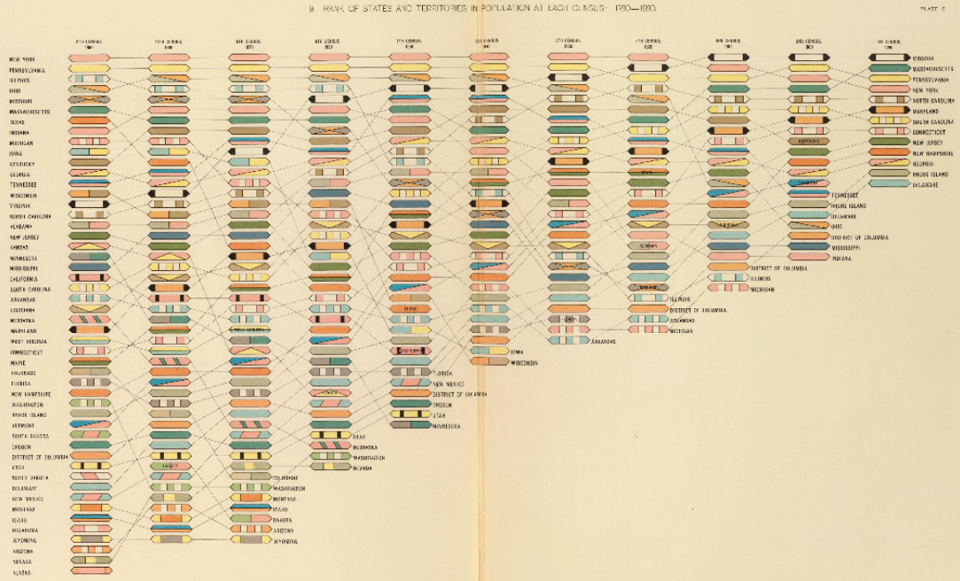
Figure source: Aigner, Miksch, Schumann, Tominski (2023, p.35), retrieved from David Rumsey Map Collection, David Rumsey Map Center, Stanford Libraries, citing Gannett (1898).
- Gannett invented (among others at the time) rank charts to visualize ranking changes over time.
- Figure: Rank of states and territories in population.
- Time goes from right to left.
1917
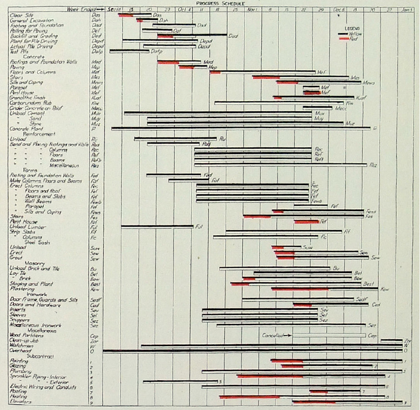
- Industrialization required efficient scheduling.
- Henry Laurence Gantt (1861–1919) studied the order of steps in work processes.
- He developed a family of timeline-based charts to visualize time-oriented processes.
- These are known as Gantt-Charts and are used nearly unchanged today!
Figure source: Aigner, Miksch, Schumann, Tominski (2023, p.32), retrieved from Internet Archive, citing 1917 Engineering News-Record.
But line charts remain the most dominant time series visualization in history.
1870
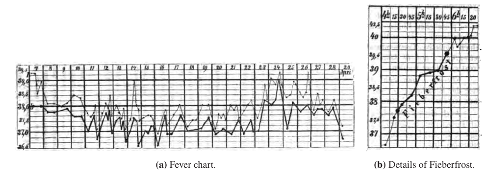
Figure source: Aigner, Miksch, Schumann, Tominski (2023, p.39), retrieved from Internet Archive, citing Wunderlich (1870).
Fever charts created by Carl August Wunderlich
1912
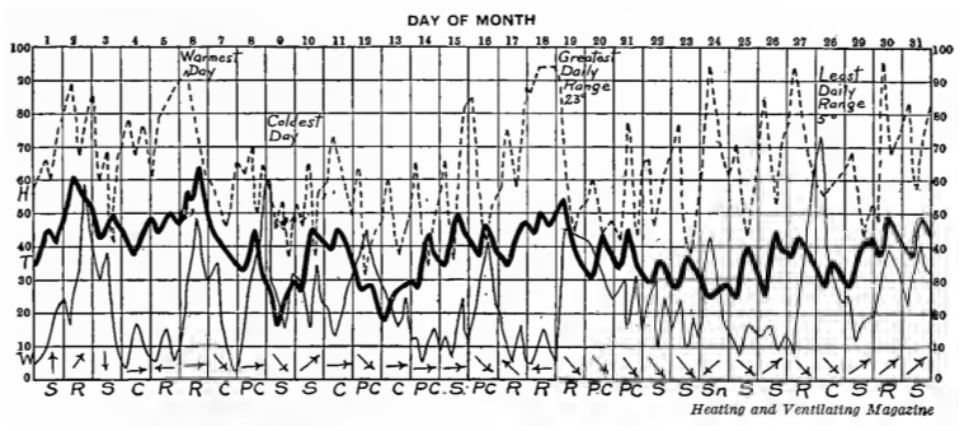
Figure source: Aigner, Miksch, Schumann, Tominski (2023, p.42), retrieved from Internet Archive, citing Brinton (1914).
Record of the Weather in New York City for December
1980
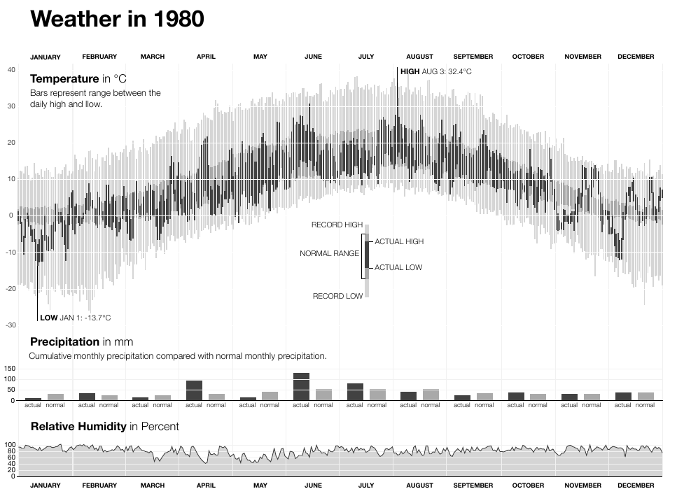
Figure source: Aigner, Miksch, Schumann, Tominski (2023, p.41).
Weather development in New York city over 30 years.
What can we observe in history?
Two main metaphors for representing time can be identified:
- Arrow/Line:
- Vast majority of visualization techniques
- Commonly, a left-to-right direction is applied where later points in time are shown toward the right.
- River:
- Metaphor of a river frequently found in historic depictions.
- Still used today: ThemeRiver and StreamGraphs.
Characteristics of Time
What, then, is time?
If no one asks me, I know what it is.
If I wish to explain it to him who asks, I do not know.
Saint Augustine (AD 354-430, The Confessions)
Modeling Time
- Find a model that
- best suited to reflect the phenomena under consideration
- support the analysis tasks at hand
- Many models exist!
- In this chapter: design aspects of modeling time
- Application-specific models can be derived from these as particular configurations
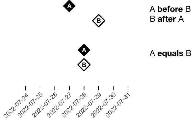
Scales (1)
Ordinal Scales
- Only relative order relations are present (e.g., before, after)
- Only relative statements are given
- We cannot discern from the given example whether Valentina woke up before or after Arvid arrived
- Example: Point and Figure Chart
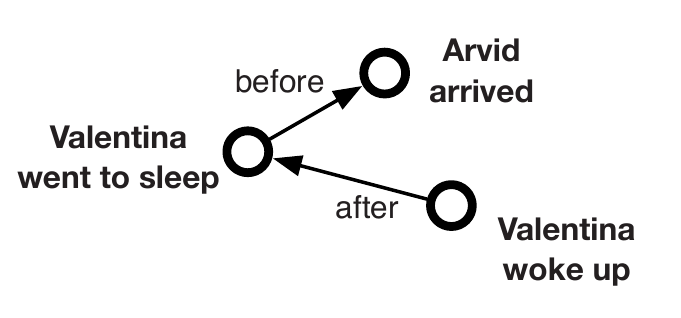
Figure source: Aigner, Miksch, Schumann, Tominski (2023, p.56).
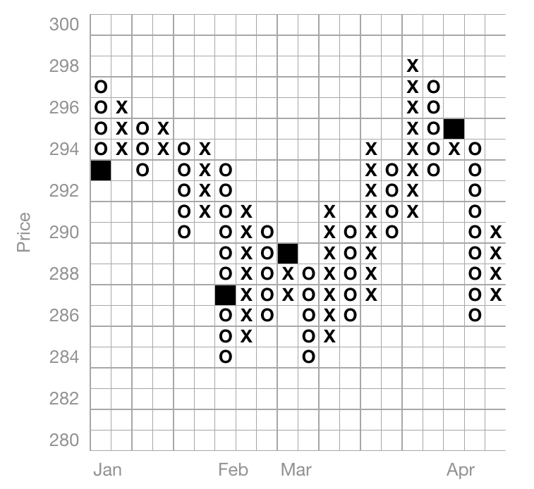
Figure source: Aigner, Miksch, Schumann, Tominski (2023, p.56), adapted from Harris (1999).
Scales (2)
Discrete Scales
- Supports temporal distance calculations
- Maps time to integers for quantitative analysis
- Uses smallest discrete units (e.g. seconds, milliseconds, UNIX timestamp)
- Common in information systems
- Example: Tile Maps
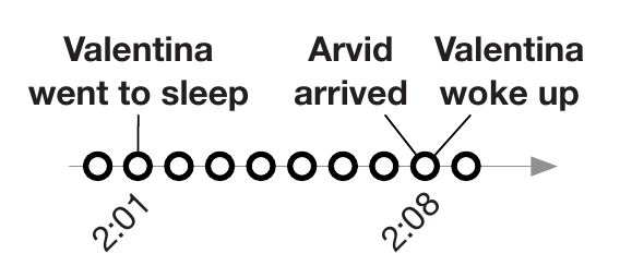
Figure source: Aigner, Miksch, Schumann, Tominski (2023, p.56).
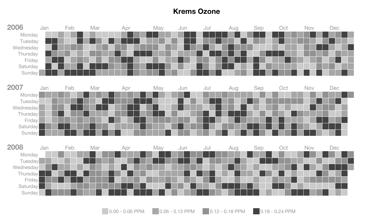
Figure source: Aigner, Miksch, Schumann, Tominski (2023, p.57), adapted from Mintz et al. (1997).
Scales (3)
Continuous Scales
- Time is mapped to the real number domain
- Between any two points in time, another point in time exists
- Dense Time
- Example: Circular Silhouette Graph
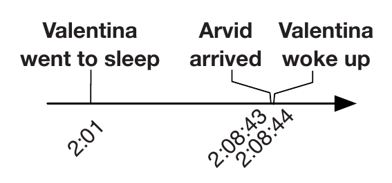
Figure source: Aigner, Miksch, Schumann, Tominski (2023, p.56).
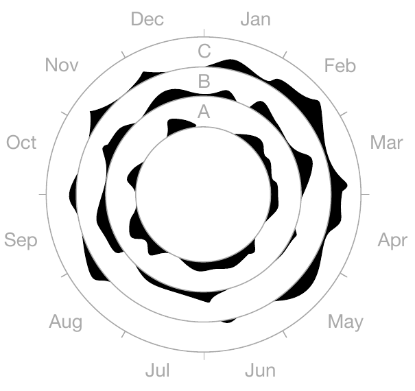
Figure source: Aigner, Miksch, Schumann, Tominski (2023, p.57), adapted from Harris (1999).
Scopes (1)
Point-Based
- Analogy to discrete Euclidean points in space
- Having a temporal extent equal to zero
- No information about the region between two points in time
- Example: Time Wheel
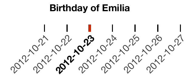
Figure source: Aigner, Miksch, Schumann, Tominski (2023, p.58).
Figure source: Aigner, Miksch, Schumann, Tominski (2023, p.58), adapted from Tominski et al. (2004).
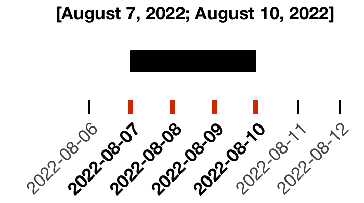
Scopes (2)
Interval-Based
- Subsections of time having a temporal extent greater than zero
- Example: October 23, 2012
- Can be either single instant: October 23, 2012 00:00:00
- Or an interval: [October 23, 2012 00:00:00, August 23, 2012 23:59:59]
- Example: Tile Maps
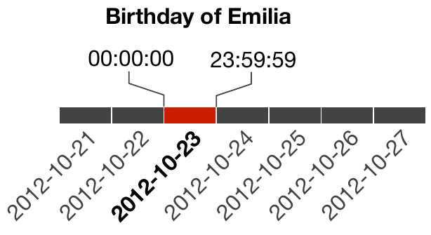
Figure source: Aigner, Miksch, Schumann, Tominski (2023, p.58).
Figure source: Aigner, Miksch, Schumann, Tominski (2023, p.57), adapted from Mintz et al. (1997).
Arrangements (1)
Linear
- Time proceeding linearly from the past to the future
- Each time value has a unique predecessor and successor
- Example: Time Wheel
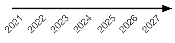
Figure source: Aigner, Miksch, Schumann, Tominski (2023, p.59).
Figure source: Aigner, Miksch, Schumann, Tominski (2023, p.58), adapted from Tominski et al. (2004).
Arrangements (2)
Cyclic
- Periodicity is very common in all kinds of data
(e.g. seasonal variations) - Any time value A is preceded and succeeded at the same time by any other time value B
- Winter comes before summer, but winter also succeeds summer
- Ese relations immediately before and immediately after.
- Usually combines with linear progression
- serial periodic data
- Monthly temperature averages over a couple of years
- Example: Circular Silhouette Graph
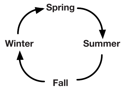
Figure source: Aigner, Miksch, Schumann, Tominski (2023, p.59).
Figure source: Aigner, Miksch, Schumann, Tominski (2023, p.57), adapted from Harris (1999).
Viewpoints (1)
Ordered
- Events are arranged in sequence, one after another.
- Totally ordered: only one event can occur at a time.
- Partially ordered: simultaneous or overlapping events are possible.
- Useful for describing linear temporal processes.
Figure source: Aigner, Miksch, Schumann, Tominski (2023, p.56).
Figure source: Aigner, Miksch, Schumann, Tominski (2023, p.56).
Viewpoints (2)
Branching
- Time splits into alternative possible paths or scenarios.
- Supports comparison of different outcomes, e.g. in project planning.
- Only one branch is expected to actually occur.
- Can model both future options and possible past causes.
- Example: Decision Chart
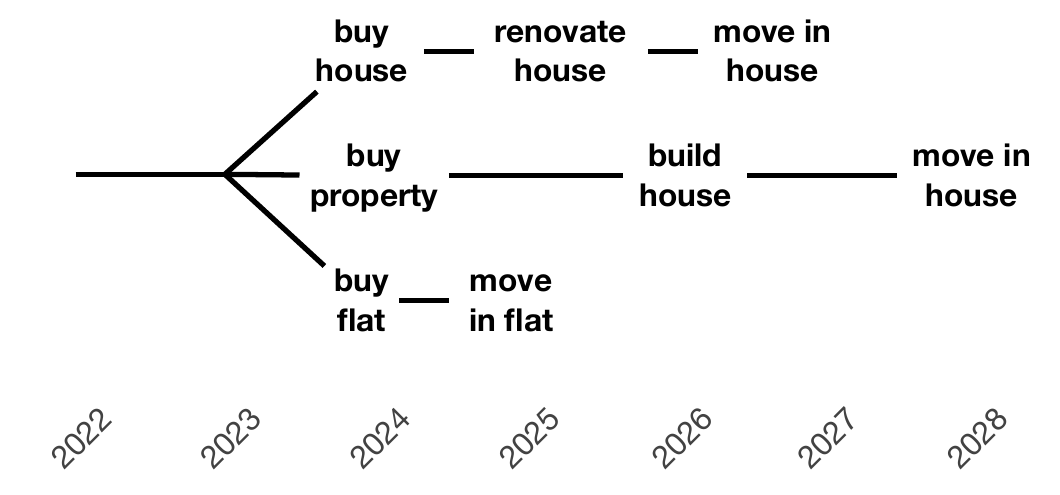
Figure source: Aigner, Miksch, Schumann, Tominski (2023, p.60).
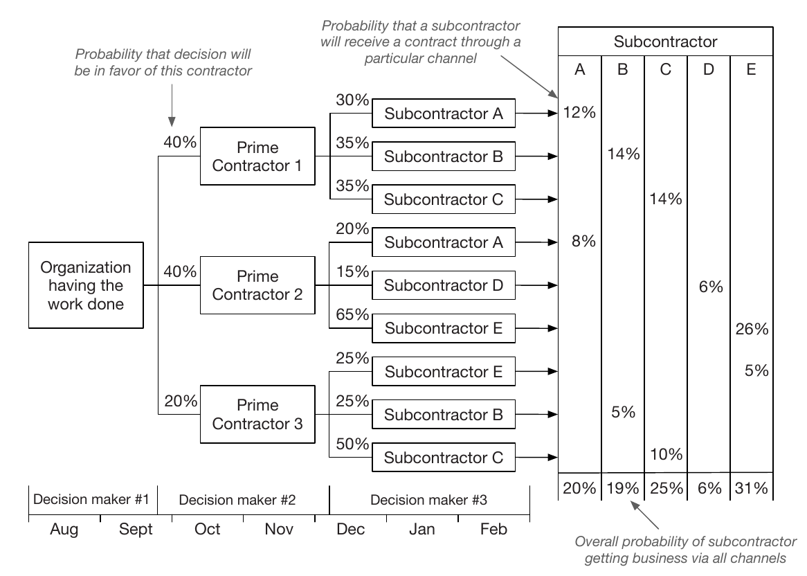
Figure source: Aigner, Miksch, Schumann, Tominski (2023, p.61), adapted from Harris (1999).
Viewpoints (3)
Multiple Perspectives
- Represents several simultaneous, possibly conflicting views of time.
- Useful for eyewitness reports, simulations, and temporal databases.
- Example: valid time (when a fact is true) vs. transaction time (when it is recorded).
- Often requires condensing different perspectives into one consistent view.
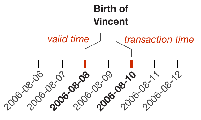
Figure source: Aigner, Miksch, Schumann, Tominski (2023, p.60).
Granularities (1)
- Granularities = human-made abstractions of time
- minutes, hours, days, weeks, months
- mappings from time values to larger or smaller conceptual units
- Chronons = non-decomposable, consecutive intervals of time
- fixed smallest granularity
- Java's java.time package uses nanoseconds
- A point in time can then be specified simply as the number of chronons relative to a reference point
- Chronons may be grouped into larger segments, termed granules.
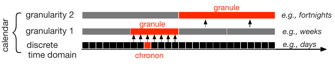
Figure source: Aigner, Miksch, Schumann, Tominski (2023, p.62).
Granularities (2)
- System of multiple granularities in lattice structures is referred to as a calendar.
- Mapping between human-meaningful time values and an underlying time domain.
- Mappings between granularities might be regular or irregular
- Seconds $\leftrightarrow$ minutes = regular
- Days $\leftrightarrow$ months = irregular
- month might be composed of 28, 29, 30, or 31 days
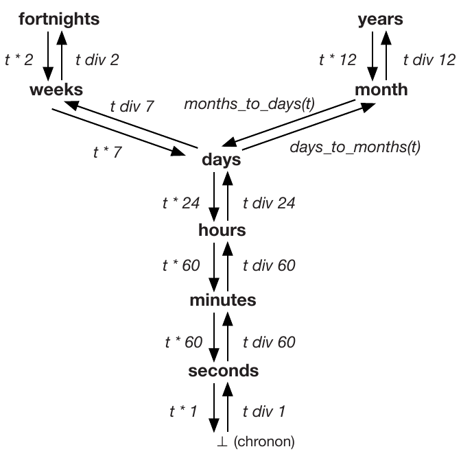
Figure source: Aigner, Miksch, Schumann, Tominski (2023, p.62).
Granularities (3)
- granularities influence equality relationships
- Example: Events A and B
- It depends on the granularity to see whether they occurred at the same time.
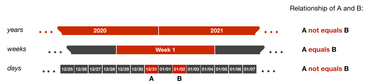
Figure source: Aigner, Miksch, Schumann, Tominski (2023, p.63).
Granularities (4)
- Example: Cycle Plots
- Combines two granularties to represent cycles and trends.
- The example shows trends of measurements of weekdays over quarters.
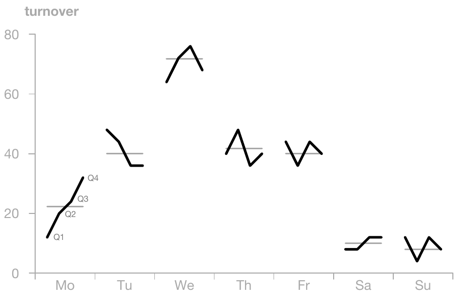
Figure source: Aigner, Miksch, Schumann, Tominski (2023, p.64), adapted from Cleveland (1993).
Time Primitives (1)
Instants
- Single, fixed position in the time domain (absolute).
- Granularity-dependent (e.g., day vs. hour vs. second).
- Can be modeled as point-like or as minimal-duration units.
- Typical use: timestamps, events, boundaries of processes.
- Relations are simple and intuitive (ordering & equality).
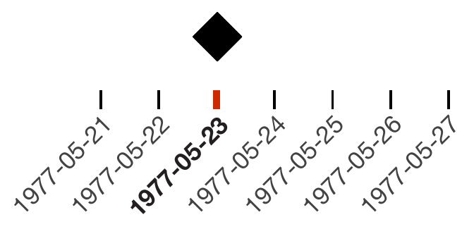
Source of figures: Aigner, Miksch, Schumann, Tominski (2023, p.65-67).
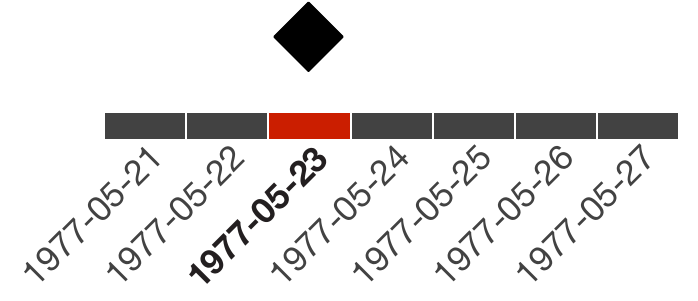
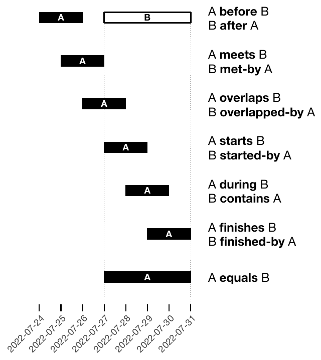
Time Primitives (2)
Intervals
- Defined by start and end instants (absolute placement).
- Represent durations with explicit temporal extent.
- Can be specified as [start, end] or start + duration.
- Usually modeled as closed intervals (inclusive boundaries).
- Capture temporal processes rather than single events.
- Relations are structurally richer (overlap, containment, adjacency).
Source of figures: Aigner, Miksch, Schumann, Tominski (2023, p.65-67).
Time Primitives (3)
Instants + Intervals
- Combine point-based and range-based temporal reasoning.
- Instants act as boundaries or probes within intervals.
- Useful for querying (e.g., “event happens during process”).
- Key concept: position of a point relative to a range.
- Supports reasoning about inclusion, boundaries, and sequencing.
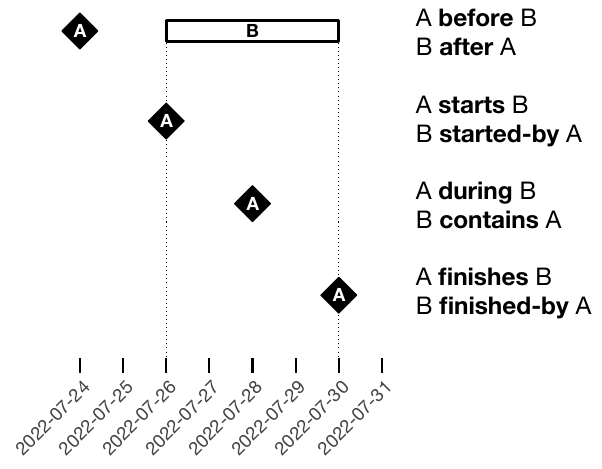
Figure source: Aigner, Miksch, Schumann, Tominski (2023, p.67).
Time Primitives (4)
Spans
- Unanchored, relative amount of time (no fixed position).
- Defined as a quantity of temporal units (e.g., “10 days”).
- Can be positive (forward) or negative (backward).
- Length depends on granularity (exact vs. irregular units like months).
- Become precise only when anchored to a specific timeline.
- Relations focus on comparison (shorter, longer, equal).
Figure source: Aigner, Miksch, Schumann, Tominski (2023, p.66).
Time Primitives (5)
Example: Gantt Chart

Figure source: Aigner, Miksch, Schumann, Tominski (2023, p.66).
Determinacy (1)
- Describes how precise and complete temporal information is.
-
Determinate:
- Exact knowledge of temporal properties.
- Requires continuous time or a single granularity.
-
Indeterminate:
- Uncertain or imprecise timing (“don’t know exactly when”).
- Examples: estimates, vague past/future, incomplete data.
- Often arises from:
- Granularity changes (e.g., days → hours).
- Explicit ranges (earliest/latest times).
Figure source: Aigner, Miksch, Schumann, Tominski (2023, p.69).
Determinacy (2)
Example: Gantt Chart with Uncertainties
Figure source: Aigner, Miksch, Schumann, Tominski (2023, p.69), adapted from Aigner et al. (2005).
BREAK - Test Yourself!
Design a time model for the following
hospital patient records dataset!
The dataset includes:
- admission and discharge times
- medication schedules (repeating daily)
- uncertain symptom onset ('sometime in the morning')
Choose: scale, scope, arrangement, granularity, determinacy level.
Figure source: Aigner, Miksch, Schumann, Tominski (2023, p.76).
Crafting Visualizations of Time-Oriented Data
In Theory:
Any time-oriented dataset should be representable
with one and the same visualization approach.
In Practice:
Dedicated visualizations are required for specific data characteristics.
Examples of Specialized Visualizations
Aigner, Miksch, Schumann, Tominski (2023, p.330).
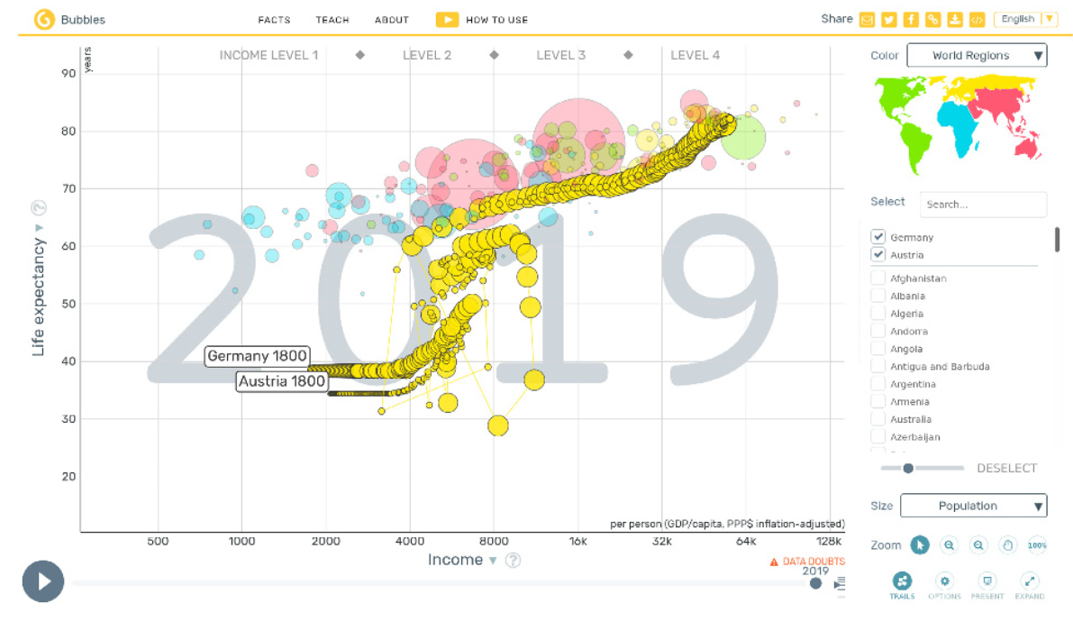
Bubbles for census data.
Aigner, Miksch, Schumann, Tominski (2023, p.66).
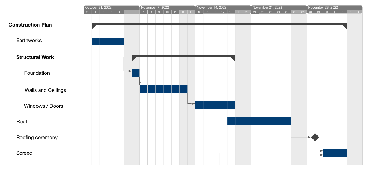
Gantt charts for project management.
Aigner, Miksch, Schumann, Tominski (2023, p.99), after Havre et al. (2002).
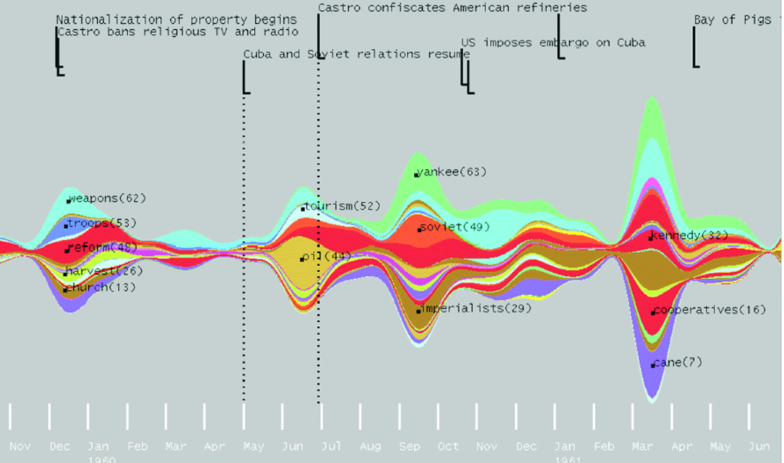
ThemeRiver for keyword evolution.
Three practical questions to choose a visualization:
- What is presented? — Time & data
- Why is it presented? — User tasks
- How is it presented? — Visual representation
What? — Time & Data
Seen in the previous chapter of this lecture
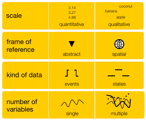
Figure source: Aigner, Miksch, Schumann, Tominski (2023, p.76-77).
Why? — User Tasks
Task Abstraction by Tominski and Schumann (2020)
Goals
- Overarching intent.
- Explore, describe, explain, confirm, or present the data.
Analytical Questions
- What is actually to be investigated.
- Elementary questions: Analysis of individual elements.
- Synoptic questions: Analysis of groups.
Targets
- Where in the data a task should be performed.
- Narrow down analysis to subset.
Means
- How a task is performed.
- Visual inspection.
- Interactive information retrieval.
- Calculations performed by the machine.
How? — Visual Representation
Large variety of visual approaches provide very different answers to this question!
Two Fundamental Criteria
- Mapping of Time
- Dimensionality of the Presentation Space
Mapping of Time (1)
There are two options for mapping time
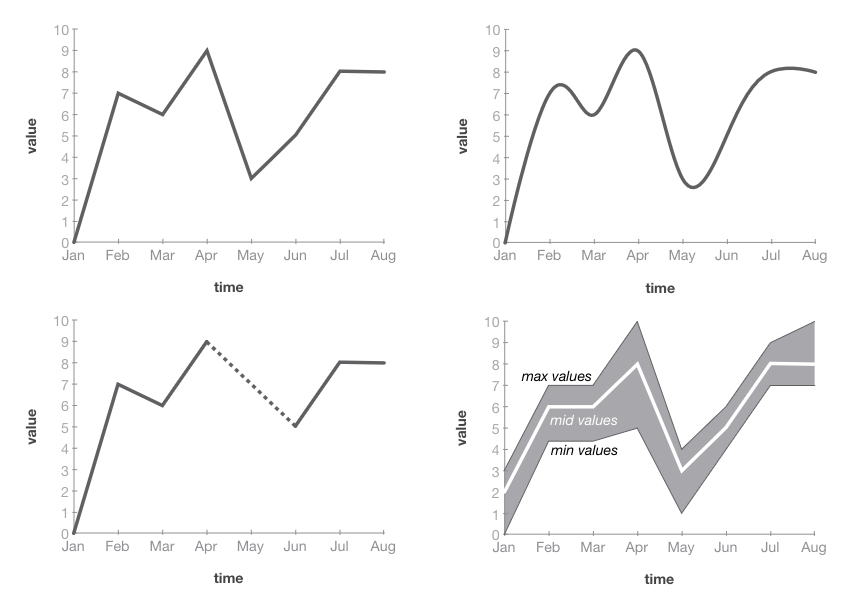
Figure source: Aigner, Miksch, Schumann, Tominski (2023, p.233).
Static
time $\mapsto$ space
Video source: https://www.youtube.com/watch?v=HzR-9tfOJQo (08:32 - 08:47)
Dynamic
time $\mapsto$ time
Mapping of Time (2)
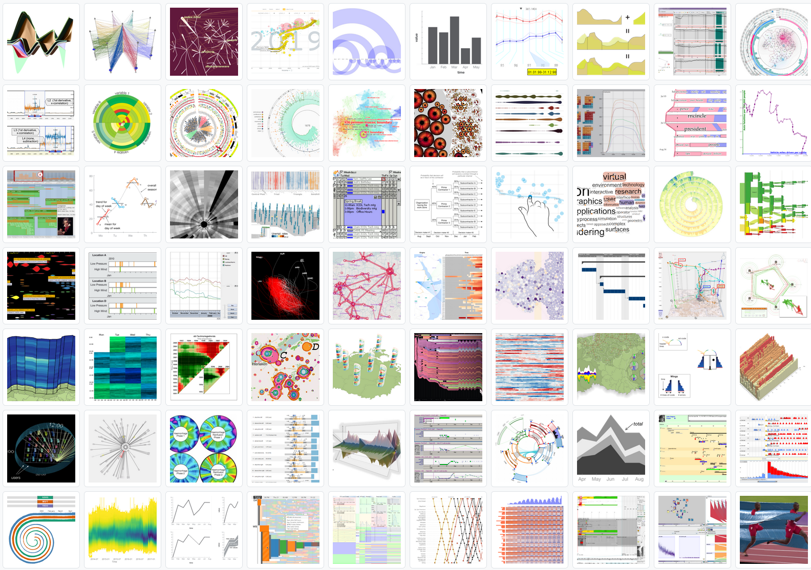
Point and Length
- Primary encoding for time (most common and effective).
- Time mapped to position along an axis (typically x-axis).
- Length used to encode durations or quantitative values.
- Supports precise reading of temporal order and intervals.
- Orthogonal mapping: data variables mapped independently (e.g., y-axis).
- Use this whenever you can!
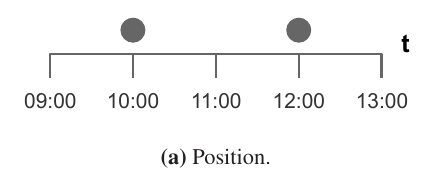
Figure source: Aigner, Miksch, Schumann, Tominski (2023, p.91).
Figure source: Aigner, Miksch, Schumann, Tominski (2023, p.91).
Mapping of Time (3)
Other Visual Variables
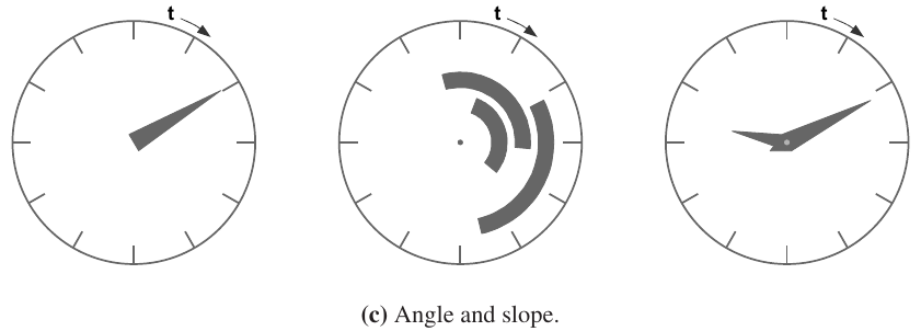
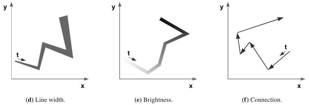
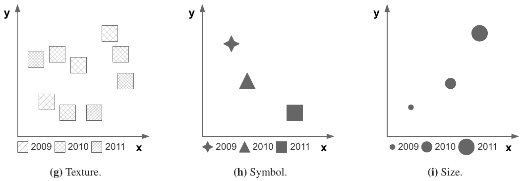
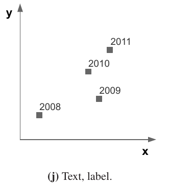
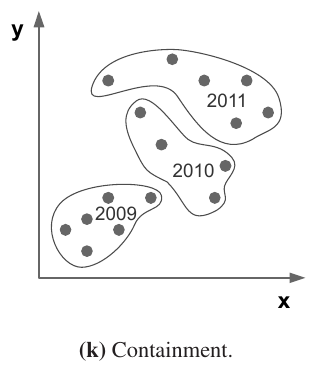
Figure source: Aigner, Miksch, Schumann, Tominski (2023, p.91).
Mapping of Time (4)
Be careful when mapping time to color!
- Each point or interval on the time axis can be visualized using a unique hue from a color scale.
- It is absolutely mandatory that the applied color scale be capable of communicating order!
- Do not use rainbow colormaps to communicate time!
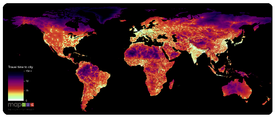
Figure source: Aigner, Miksch, Schumann, Tominski (2023, p.92), after Weiss et al. (2018).
Mapping of Time (5)
Small Multiples
- Miniature visual representation per time point.
- Single thumbnail may contain much more visual information than basic graphical primitives.
- Number of shown thumbnails limited by screen space.
- Challenge: Finding good trade-off between the complexity of the visual encoding of time and that of the data
Figure source: Aigner, Miksch, Schumann, Tominski (2023, p.359).
Mapping of Time (6)
Dynamic Representations
- Time encoded via physical time (animation) instead of display space.
- Visualization shown as a sequence of frames over time.
- Ideal (rare): 1:1 mapping between time steps and frames.
- Practical adaptations:
- Interpolation for sparse data.
- Aggregation / sampling for large datasets.
- Perception-dependent display:
- Animation: ~15–25 fps (continuous motion).
- Slide show: 1 frame every 2–4s (discrete).
- Representation choice:
- Few snapshots → slide show.
- Highly dynamic data → animation.
- Strength: supports qualitative understanding of dynamics.
- Limitation: weak for precise quantitative reading.
Video source: https://www.youtube.com/watch?v=HzR-9tfOJQo (08:32 - 08:47)
Mapping of Time (7)
Static Representations
Advantage:
- All data visible at once → supports direct comparison.
- Easy to analyze relationships between time and data.
- Well suited for detailed and quantitative analysis.
Disadvantage:
- Requires screen space for both time axis and data.
- Can become cluttered with large or complex datasets.
- Needs interaction or aggregation to remain readable.
Dynamic Representations
Advantage:
- Effectively conveys trends and temporal evolution.
- Frees spatial dimensions for richer data encoding.
- Natural linear mapping of time → intuitive progression.
- Can be enhanced through user interaction (e.g., playback control).
Disadvantage:
- Hard to track multiple changes simultaneously.
- Limited support for precise quantitative comparison.
- Can overwhelm users with complex or long sequences.
- Often not ideal for large multivariate datasets.
Dimensionality of the Presentation Space (1)
2D is the most common dimension for data visualizations.
The cartesian coordinate system works well with linear time.
Dimensionality of the Presentation Space (2)
But the previously shown dataset follows a rather cyclic nature:
What if we want to compare cycles?
Dimensionality of the Presentation Space (3)
Instead of cartesian coordinates, we could use polar coordinates:
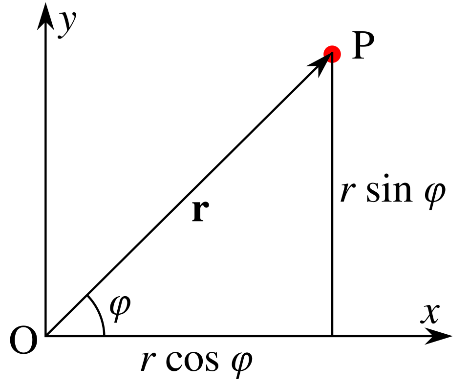
Figure source: Wikimedia Commons
Dimensionality of the Presentation Space (4)
The transformation is achieved by aligning the cycles along an Archmidean spiral:
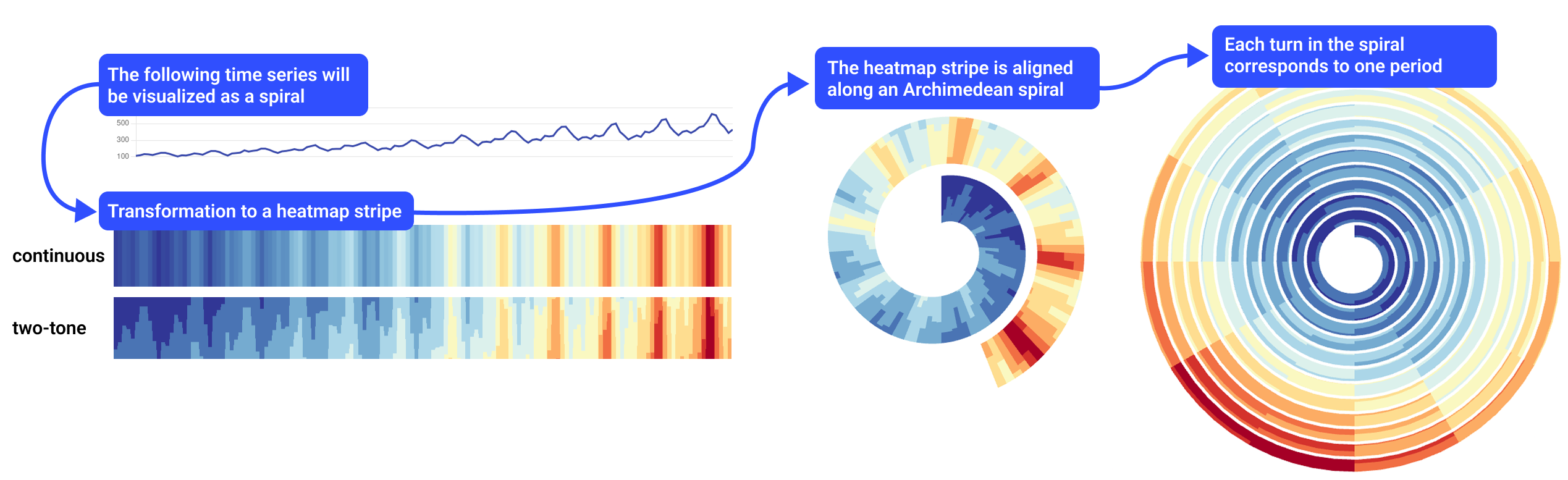
Figure source: Rakuschek, Hauser, Schreck (2026).
Cartesian coordinates $\rightarrow$ polar coordinates
Dimensionality of the Presentation Space (5)
Parameterization matters!
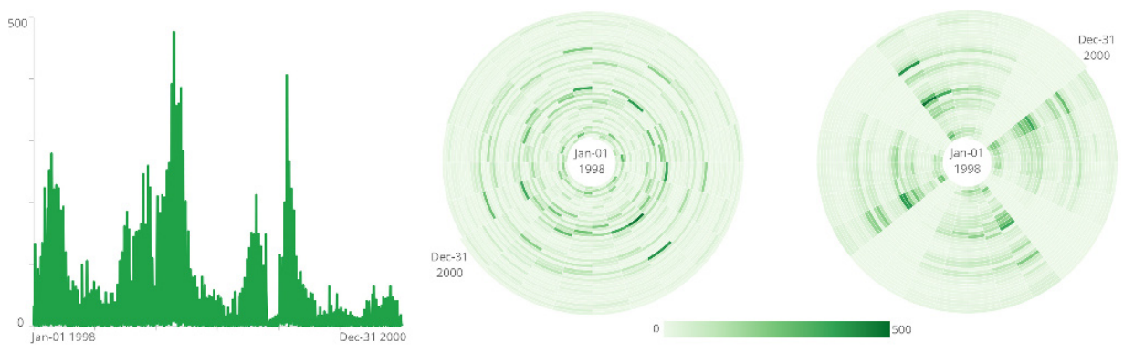
Figure source: Aigner, Miksch, Schumann, Tominski (2023, p.98).
Left spiral: 24 days, right spiral: 28 days.
The cyclic pattern becomes only visible when choosing a suitable cycle length.
Dimensionality of the Presentation Space (6)
So, what if we have multiple cyclic time series, each associated with a point in space?
- 2D $\rightarrow$ 3D
- The x- and y-axis are used for spatial coordinates (map of Switzerland).
- The z-axis is used as the time axis.
- The spirals are now helices in 3D.
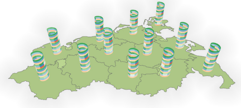
Figure source: Aigner, Miksch, Schumann, Tominski (2023, p.96).
More on spatiotemporal visualizations in the next lecture!
Dimensionality of the Presentation Space (7)
Danger Warning: Usage of 3D must be well justified!

Figure source: Tim Rich and Lesley Katon, via Flickr.
3D can make sense in certain scenarios,
but whether 2D or 3D is better is a heated debate in the community.
Dimensionality of the Presentation Space (8)
2D
Advantage:
- Clear and easy to interpret.
- No occlusion or hidden information.
- No distortion from perspective.
- Well suited for most analysis tasks.
Disadvantage:
- Limited encoding capacity for complex data.
- May not scale well for high-dimensional datasets.
- Less natural for inherently 3D data.
3D
Advantage:
- Additional dimension for encoding information.
- Natural fit for spatial / geo-spatial data.
- Aligns with human 3D perception.
- Supports richer and more expressive representations.
Disadvantage:
- Occlusion can hide important information.
- Perspective can distort perception.
- Higher interaction complexity required.
- Harder to interpret without proper design support.
Color Coding (1)
How do we choose suitable colors?
Depends on the task!
Color Coding (2)
Remember from earlier:
Analytical Questions
- What is actually to be investigated.
- Elementary questions: Analysis of individual elements.
- Synoptic questions: Analysis of groups.
Two basic analytical questions:
- Identify: What are the data? (Reading the chart as a whole)
- Locate: Where are the data? (Pinpointing specific values in the chart)
These can be both elementary and synoptic questions.
Color Coding (3)
The color scale is:
- ... segmented for synoptic questions.
- ... unsegmented for elementary questions.
- ... sparse in colors for location tasks.
- ... dense in colors for identification tasks.
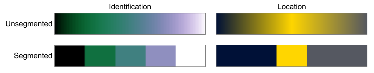
Figure source: Aigner, Miksch, Schumann, Tominski (2023, p.104).
Color Coding (4)
Example: Spiral Visualization
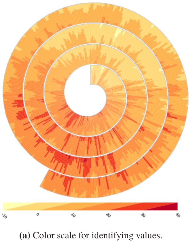
Figure source: Aigner, Miksch, Schumann, Tominski (2023, p.105).
Color Coding (5)
One tip for identification tasks:
- Allocate more colors to dense regions.
- Use quartiles to find the region where 50% of values accumulate.
- You want to have more discriminating power in this region.
- Outliers create sparse regions where only few data points accumulate, we do not need many colors to distinguish them.
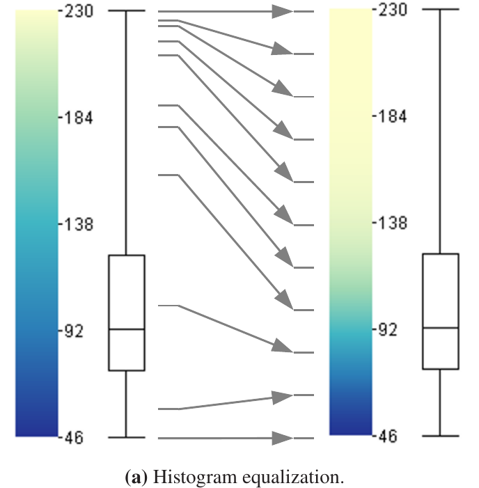
Figure source: Aigner, Miksch, Schumann, Tominski (2023, p.107).
Line Plots (1)
Figure source: Aigner, Miksch, Schumann, Tominski (2023, p.233).
Line charts are the most common time series visualization, so let's discuss some intricacies!
Line Plots (2)
- Use a suitable aspect ratio.
- Important for lookup tasks.
- A good aspect ratio ensures
that the average angle of
line segments is 45°.
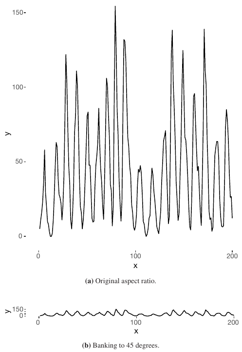
Figure source: Aigner, Miksch, Schumann, Tominski (2023, p.111).
Line Plots (3)
- Often we need to compare multiple time series that share the same time axis.
- Example: Closing prices of Amazon and Twitter.
- Problem: Largely different value domains.
- Superimposition in such cases not the best option.
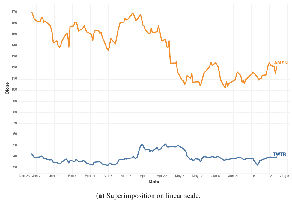
Figure source: Aigner, Miksch, Schumann, Tominski (2023, p.112).
Line Plots (4)
- Superimposition: Both time series are depicted in the same line chart.
- Apply log scaling to avoid large values dominating the axis.
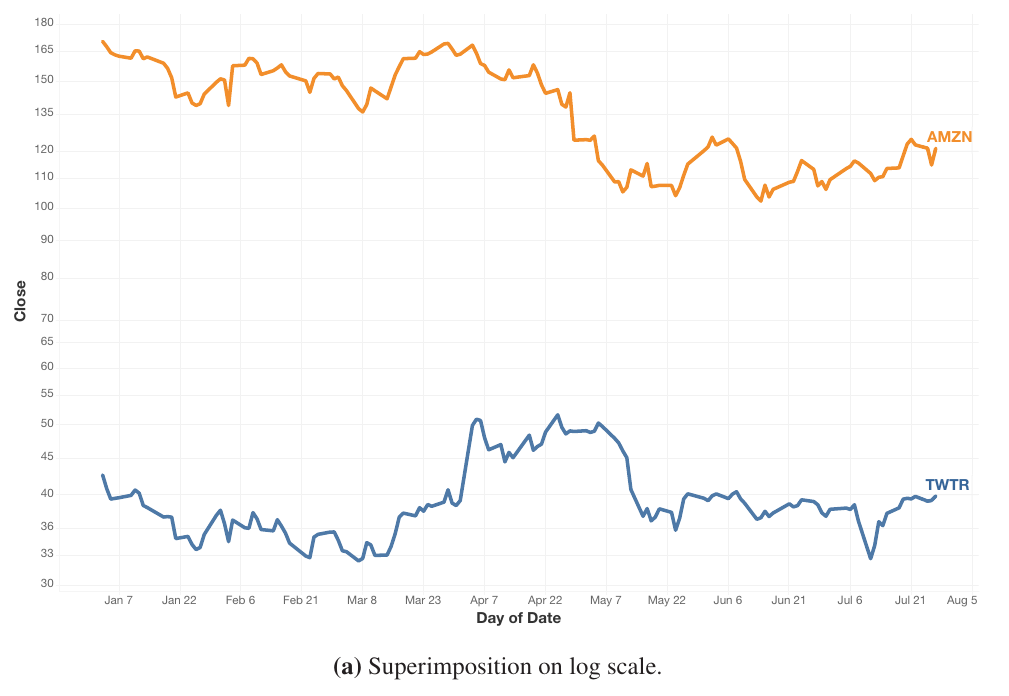
Figure source: Aigner, Miksch, Schumann, Tominski (2023, p.113).
Line Plots (5)
- Juxtaposition: Separate line charts for both time series, displayed beneath each other to synchronize the time axis.
- The dynamics of the smaller value range are much better perceivable.
- Closely related to small multiples.
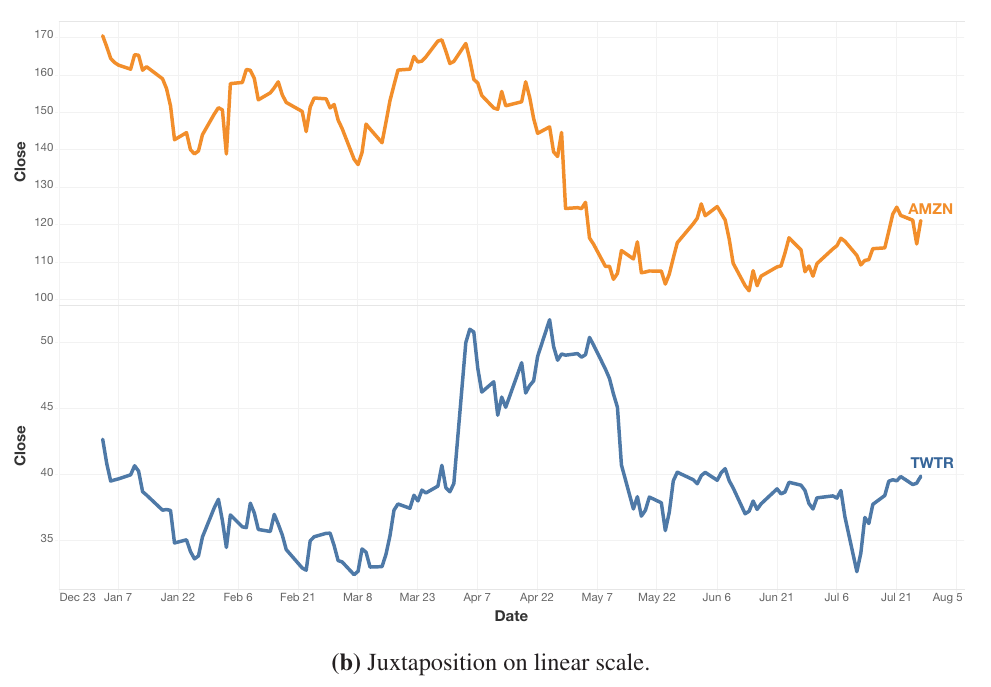
Figure source: Aigner, Miksch, Schumann, Tominski (2023, p.112).
Line Plots (6)
- Indexing: Compute relative change to an anchor for each value.
- All displayed time-series values use the same percent dimension.
- Indexing yields higher correctness rate than juxtaposition or superimposition with log scale.
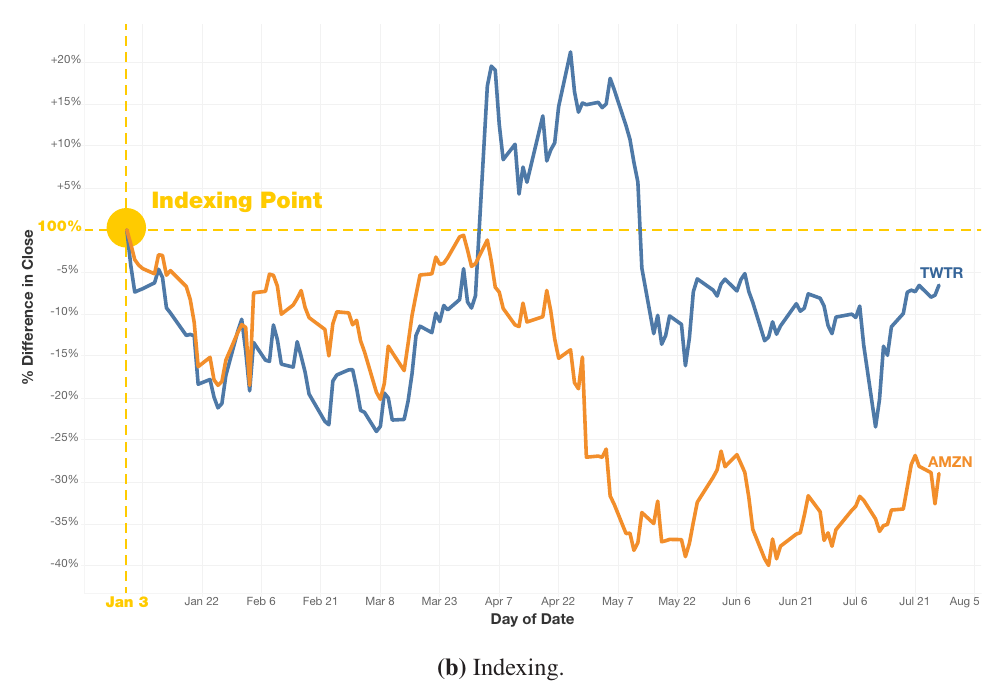
Figure source: Aigner, Miksch, Schumann, Tominski (2023, p.113).
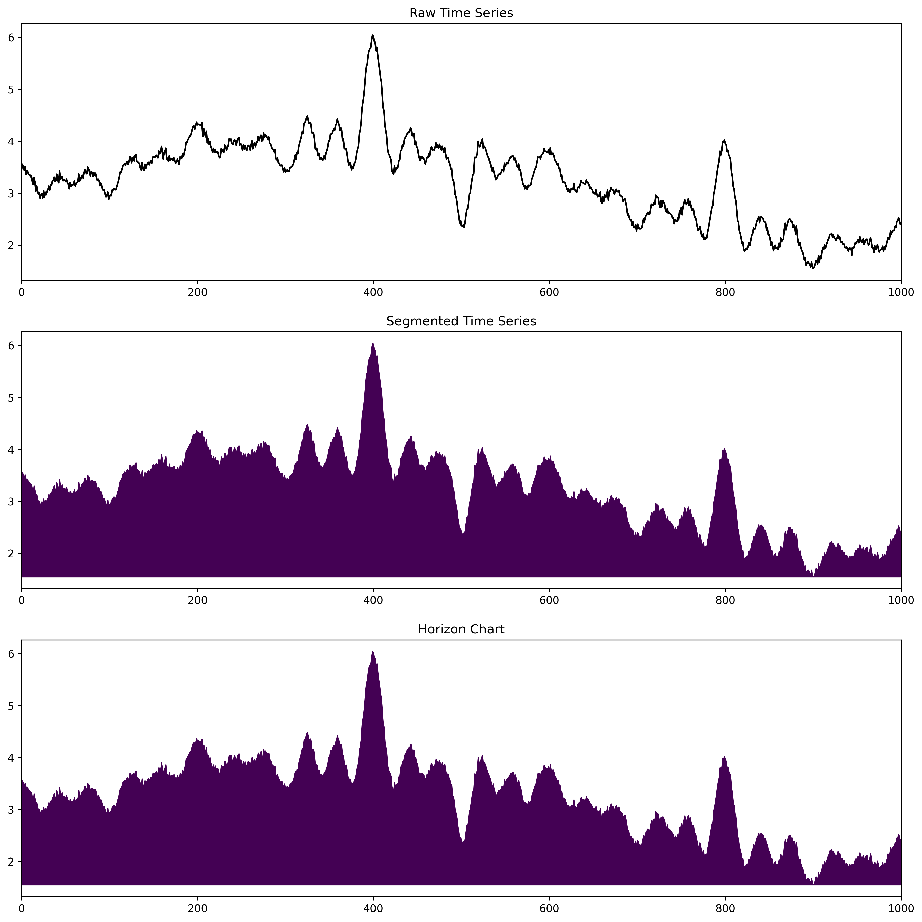
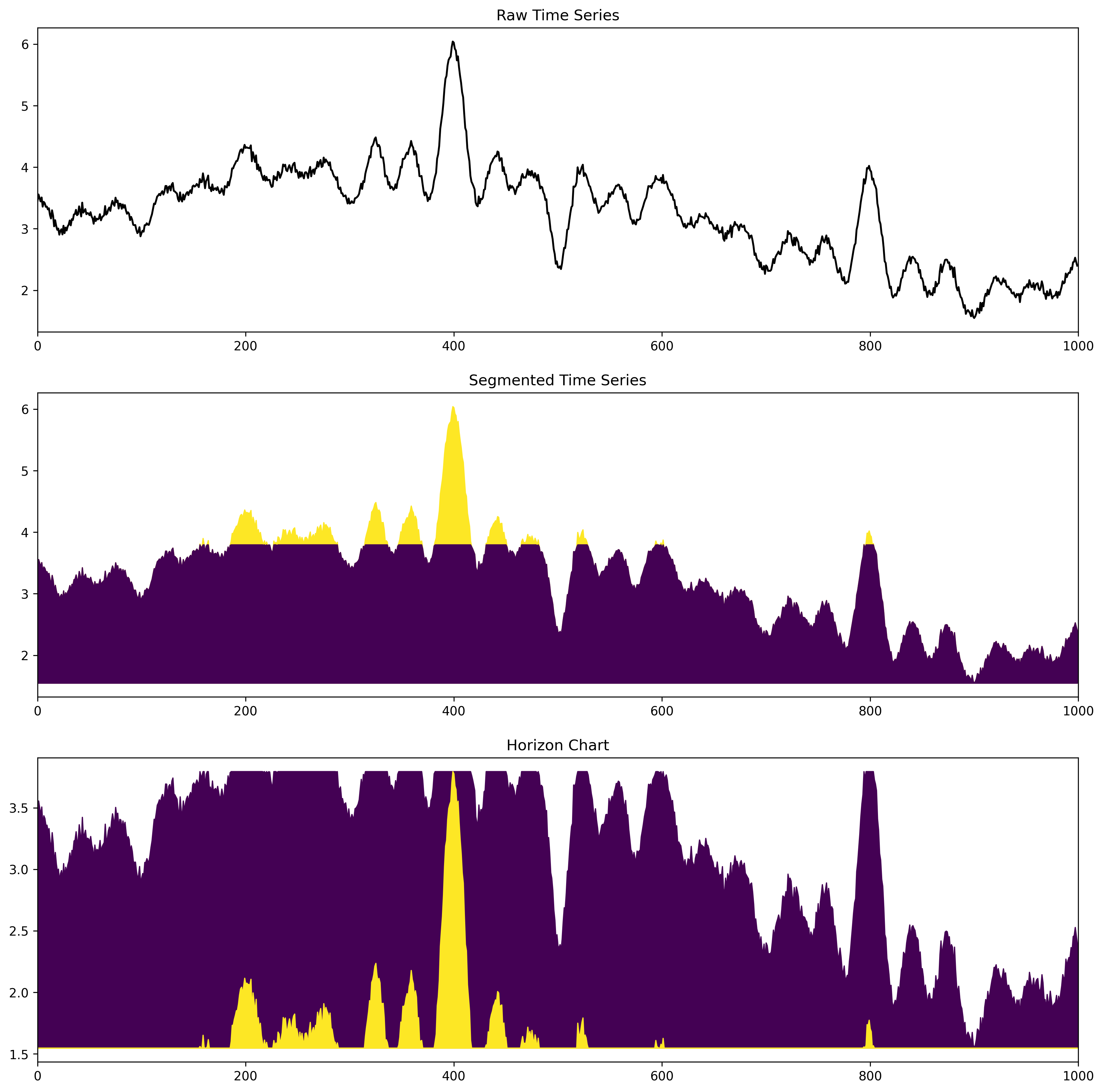
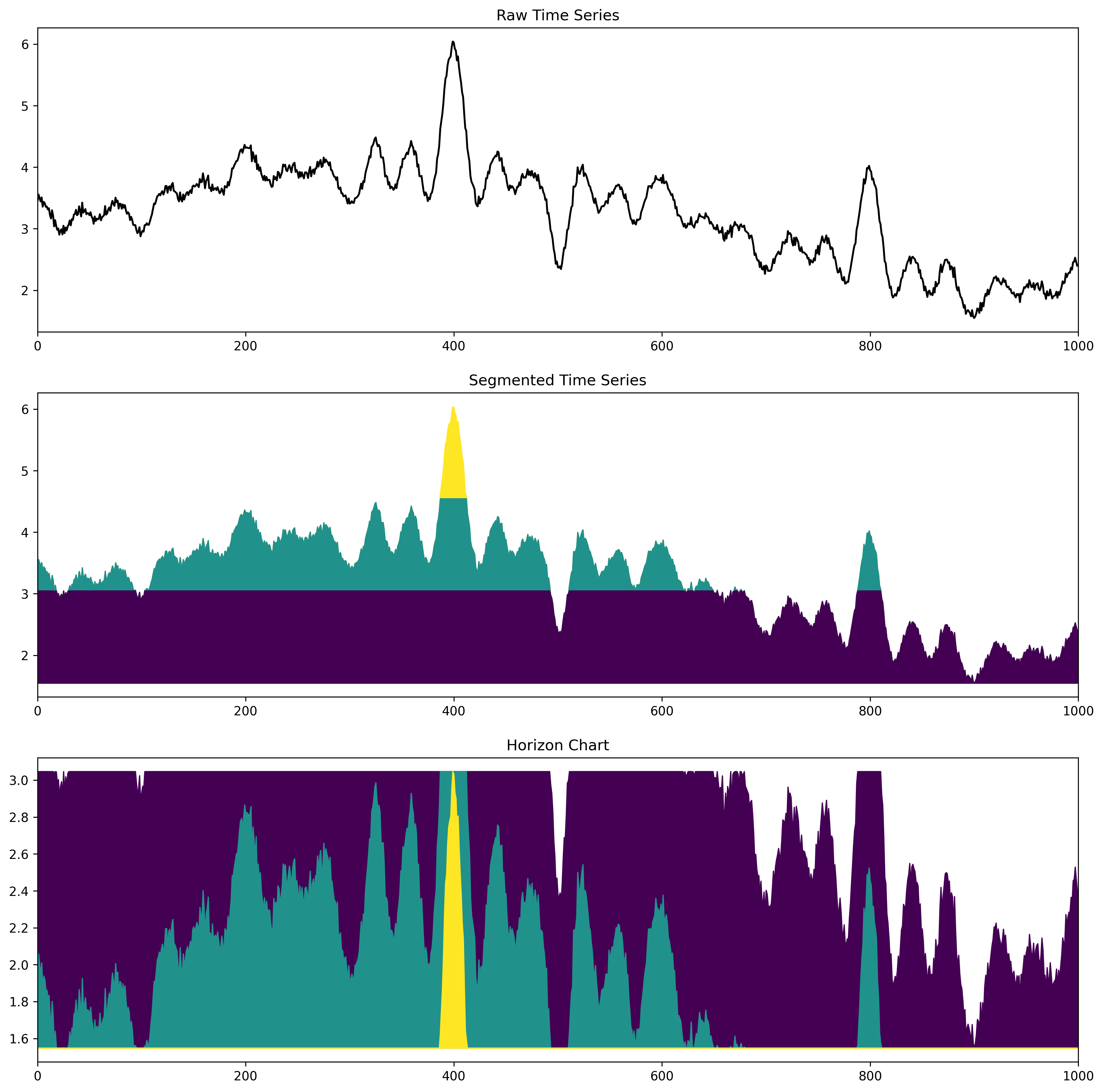
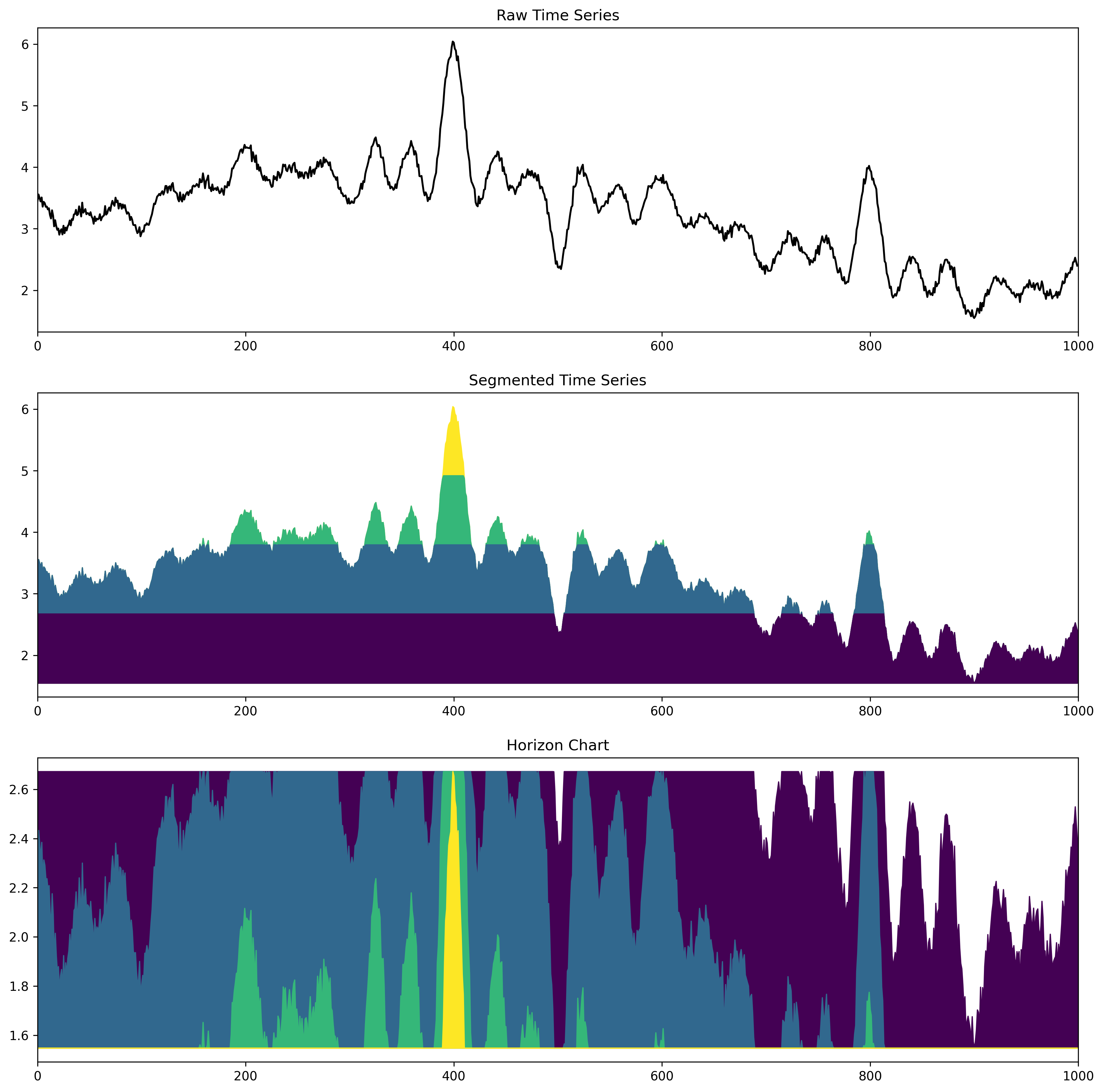
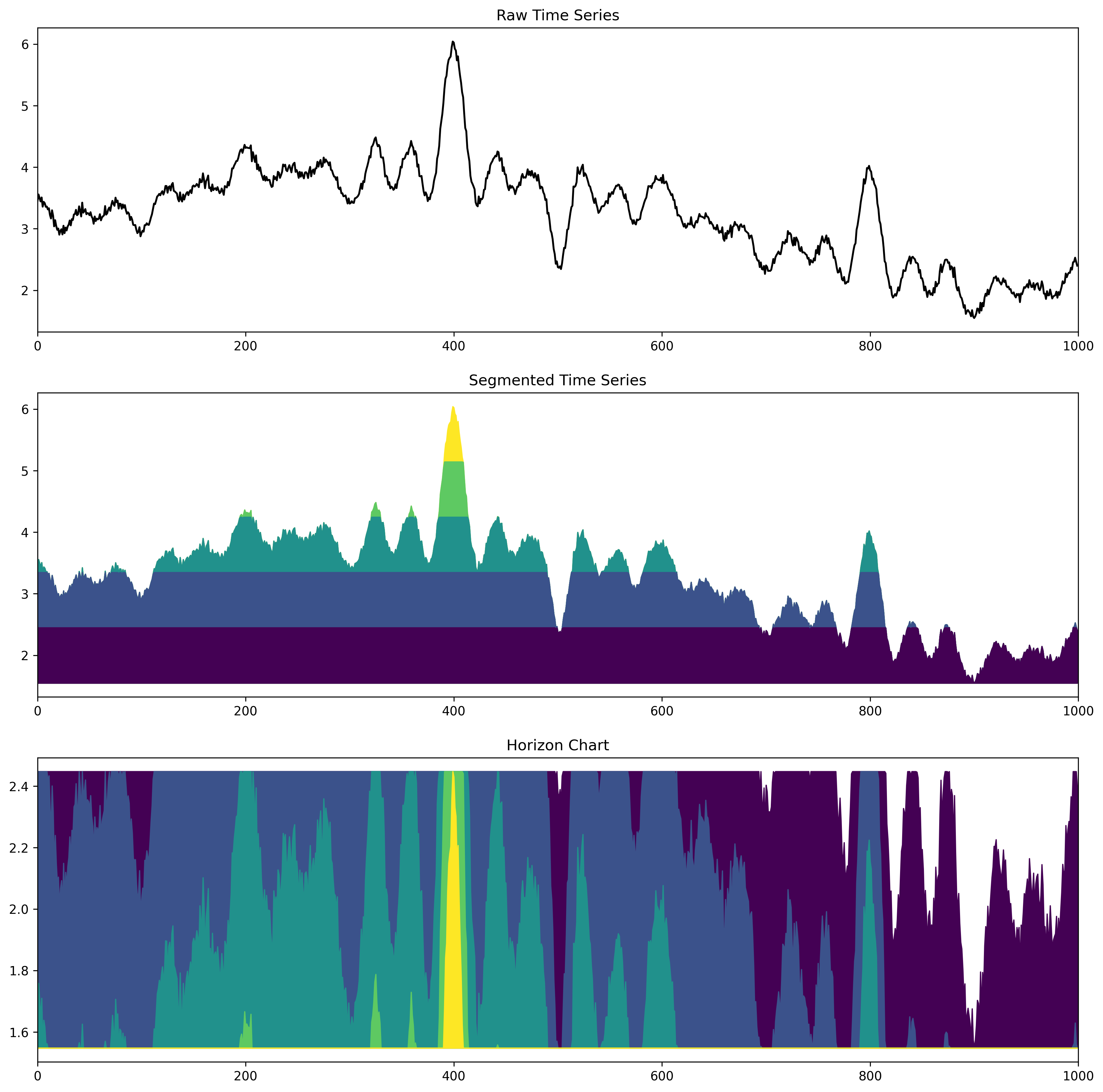
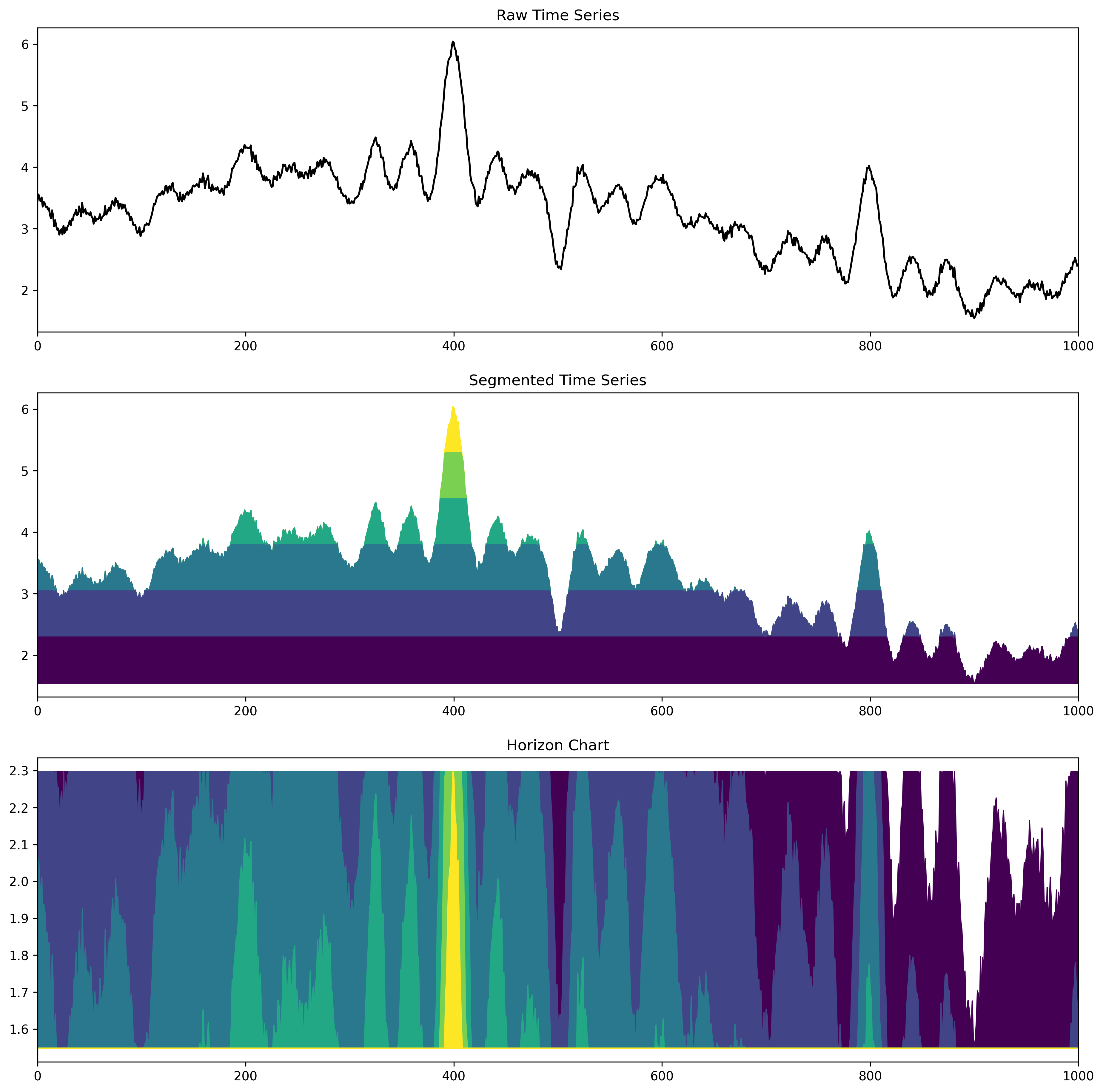
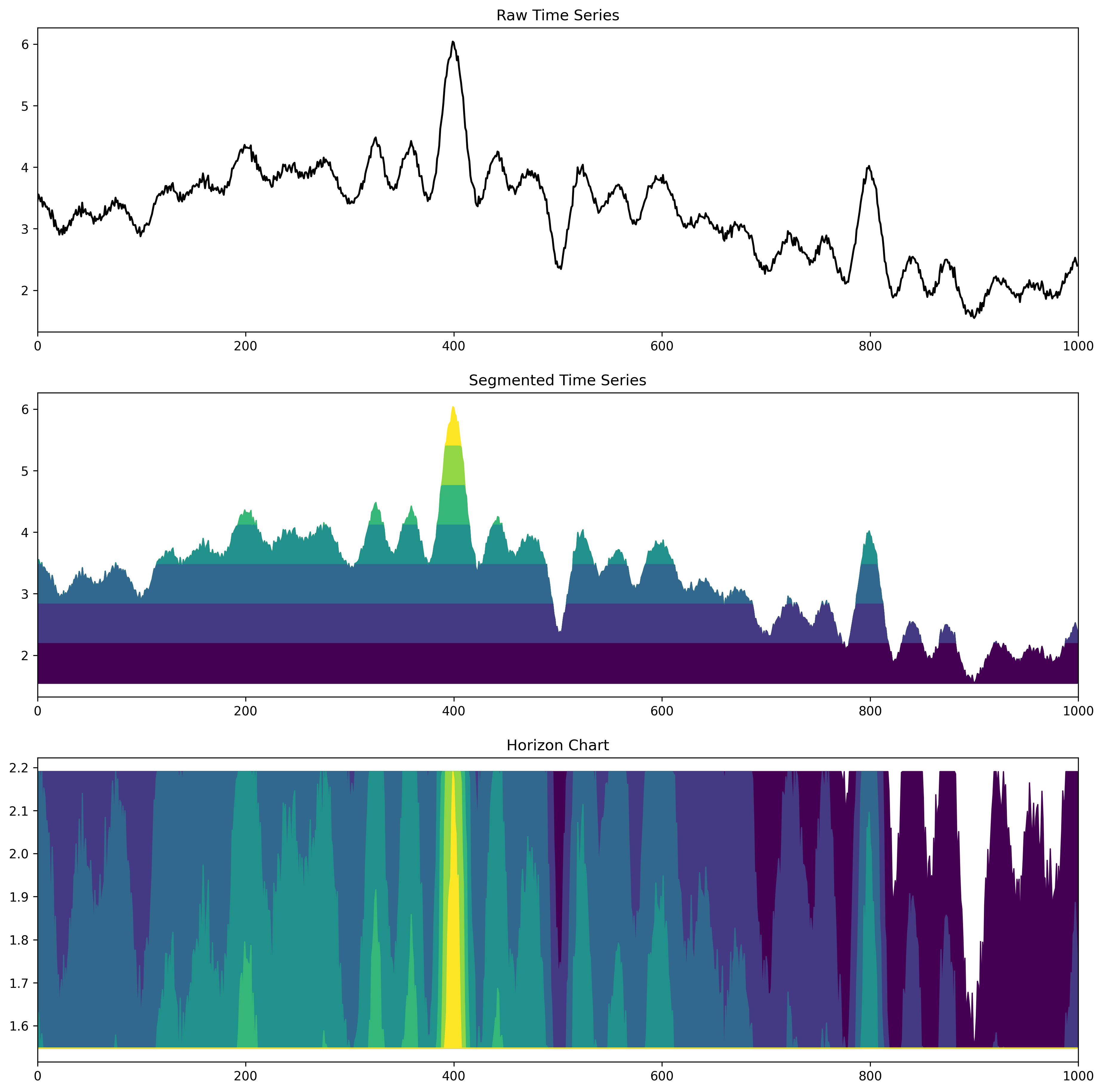
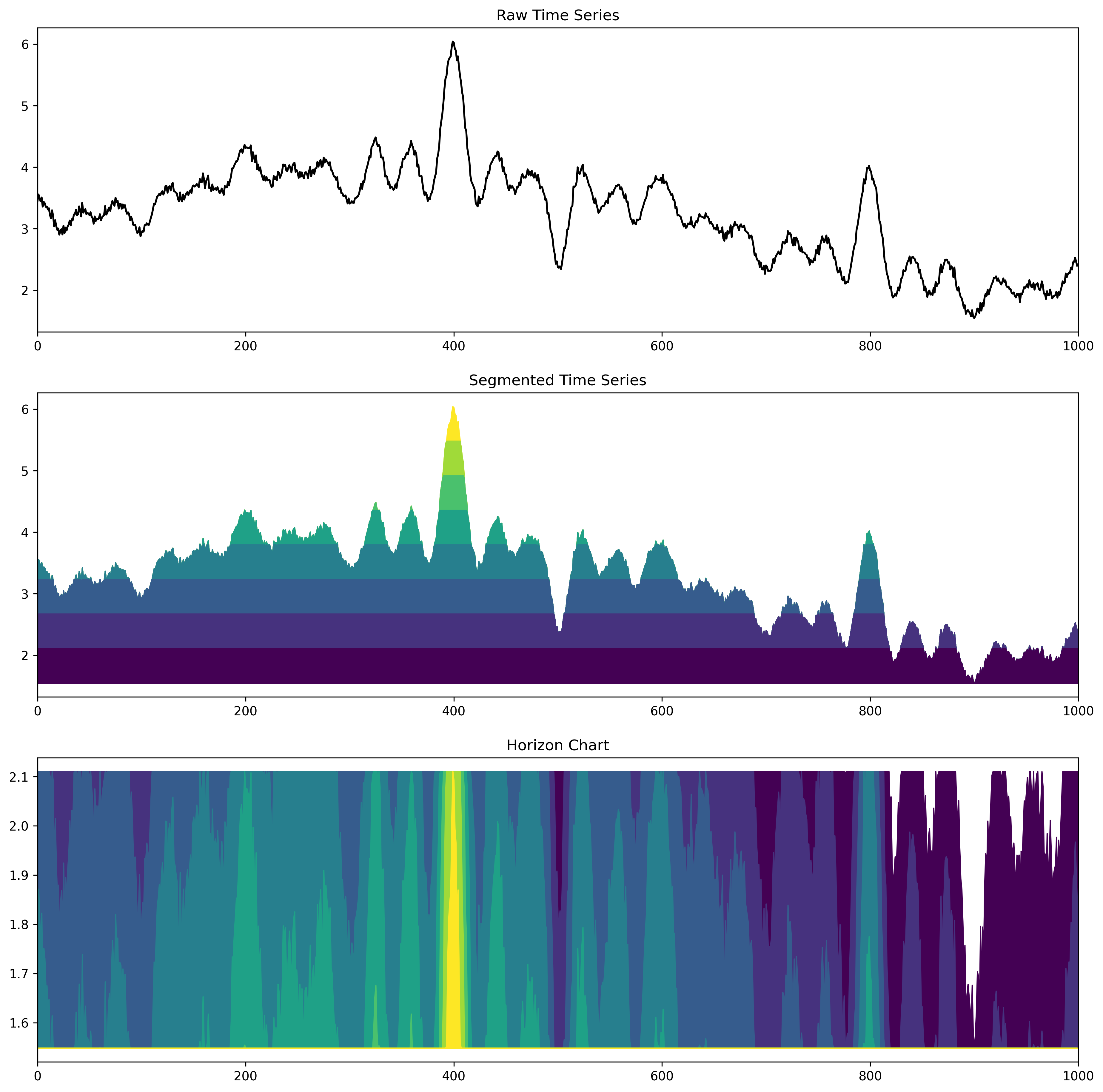
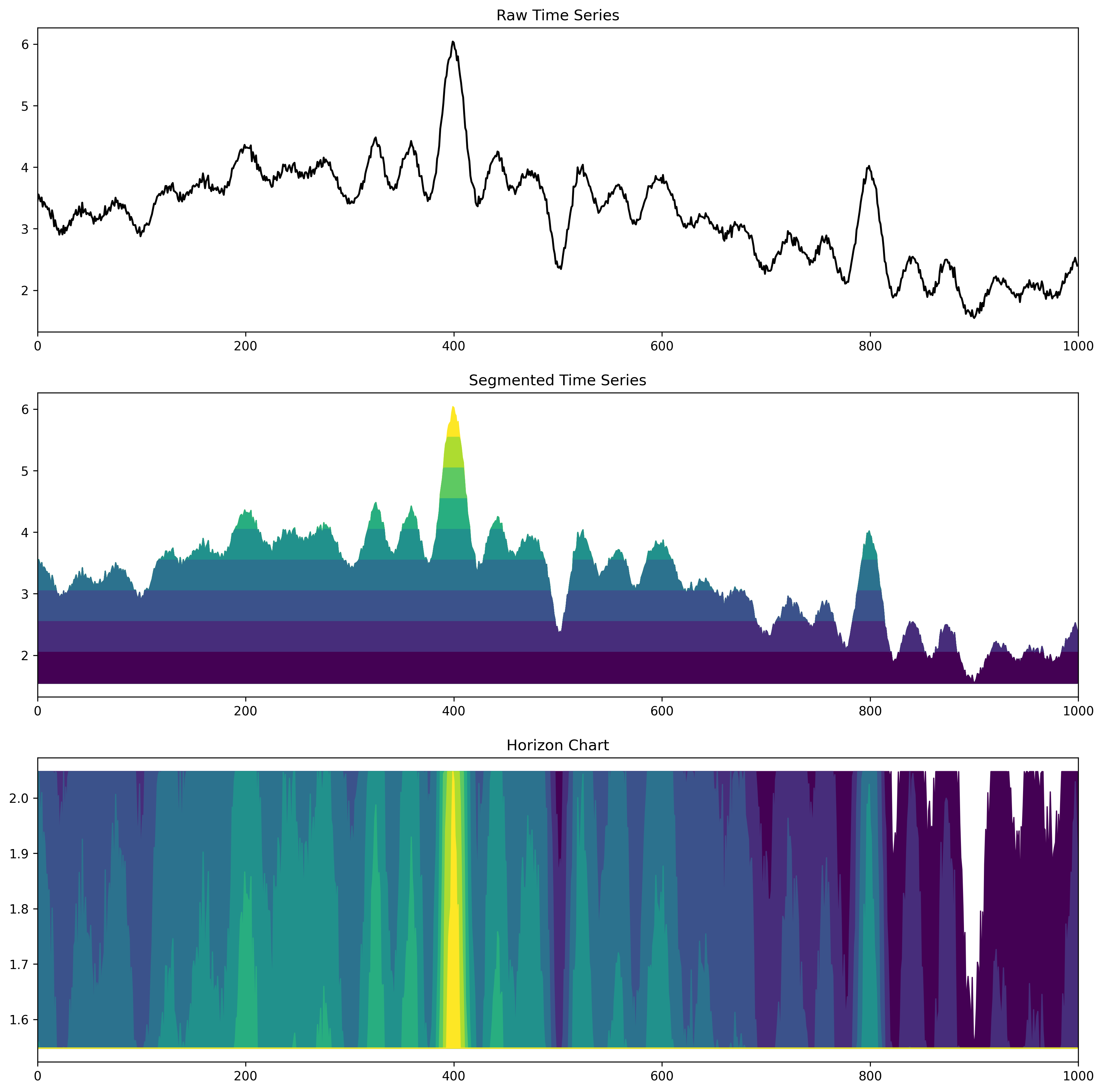
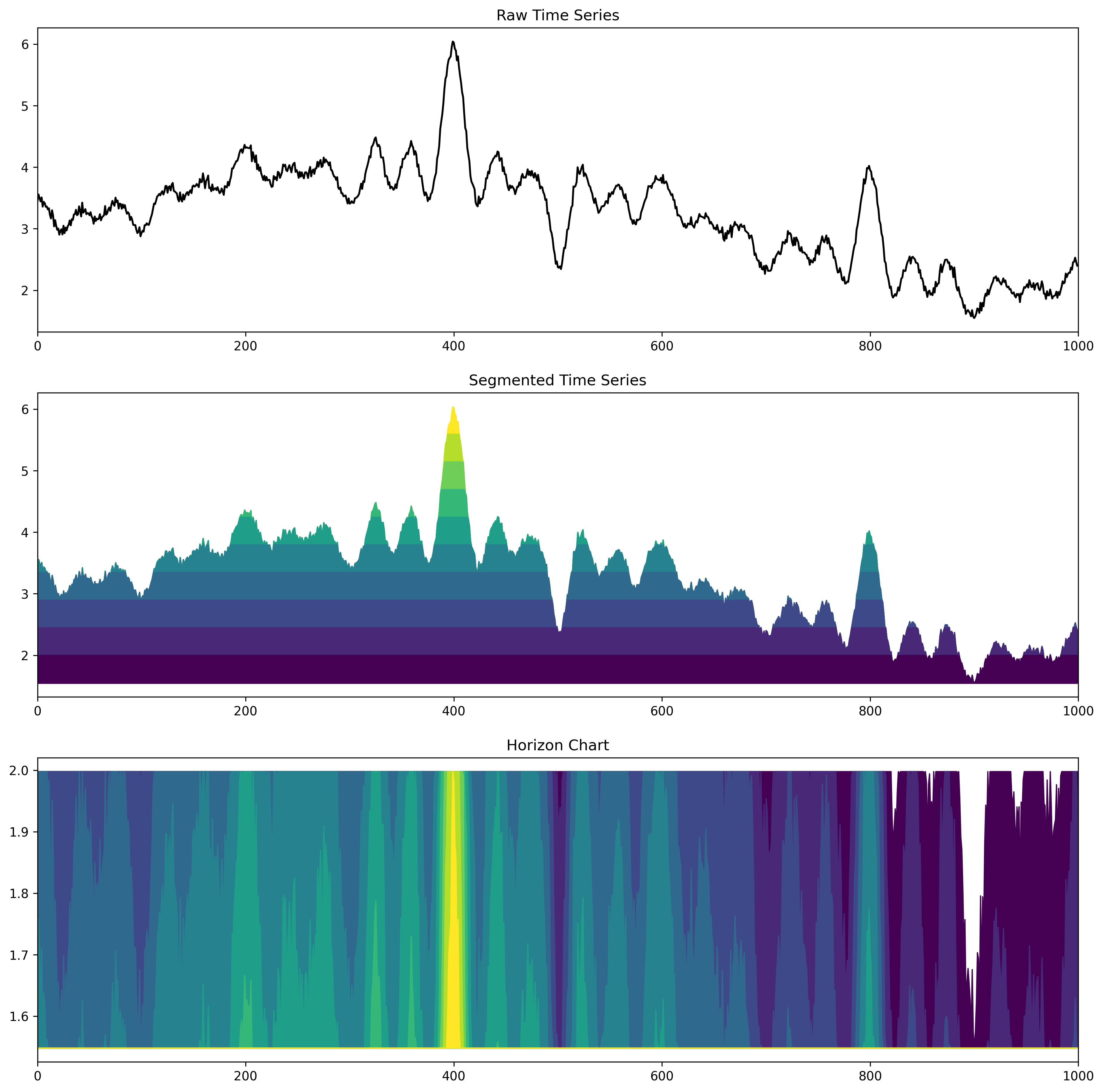
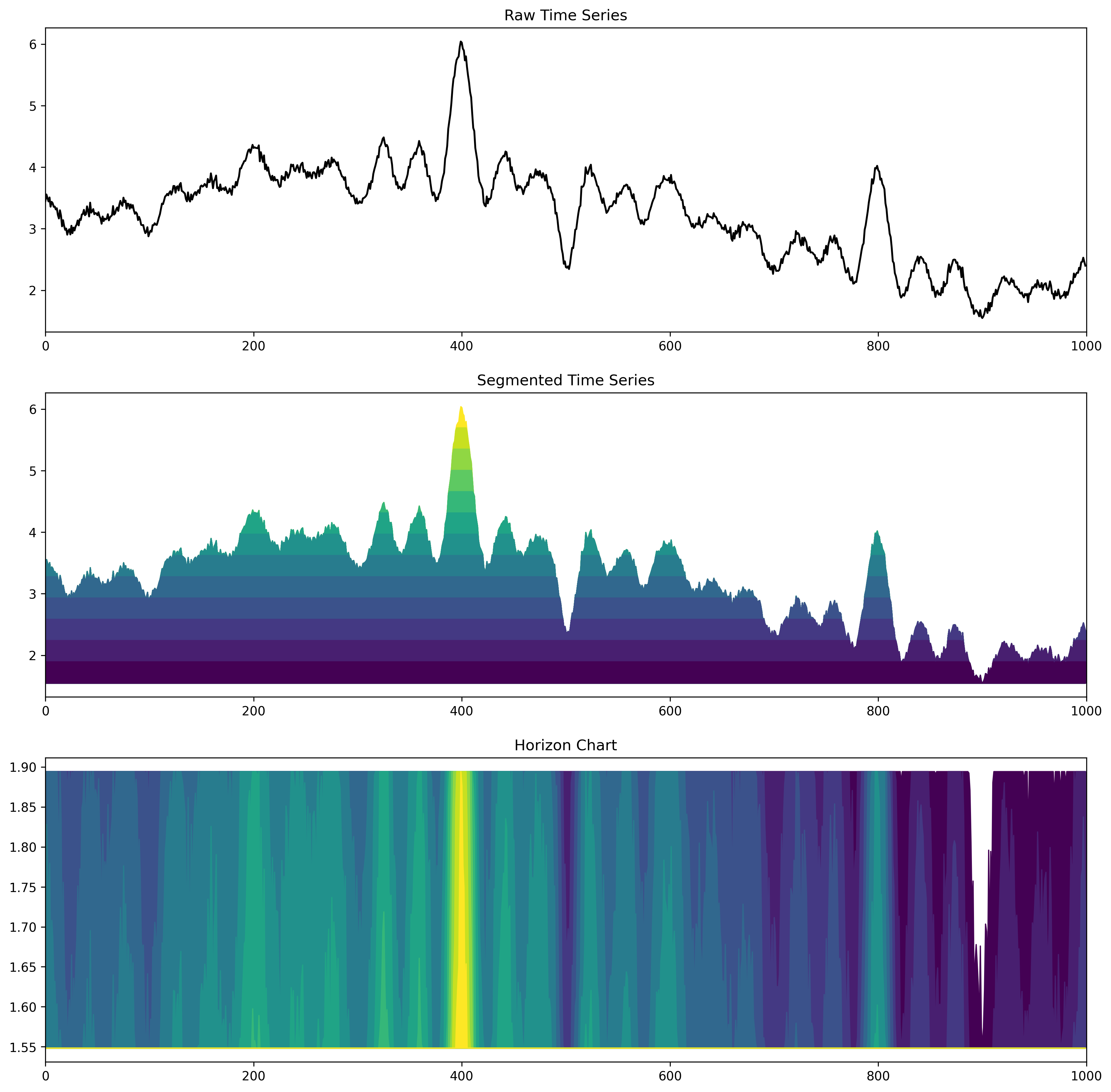
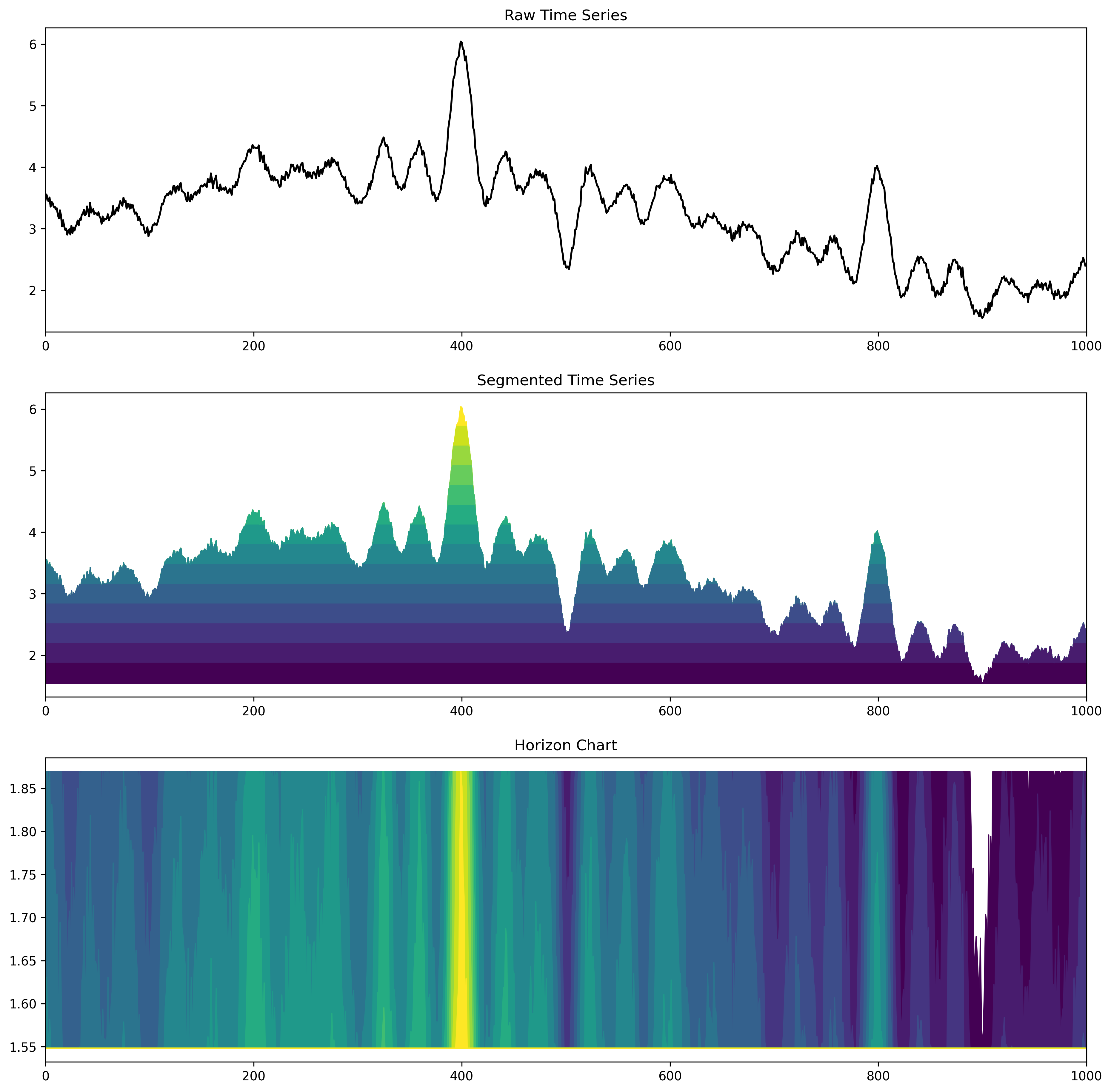
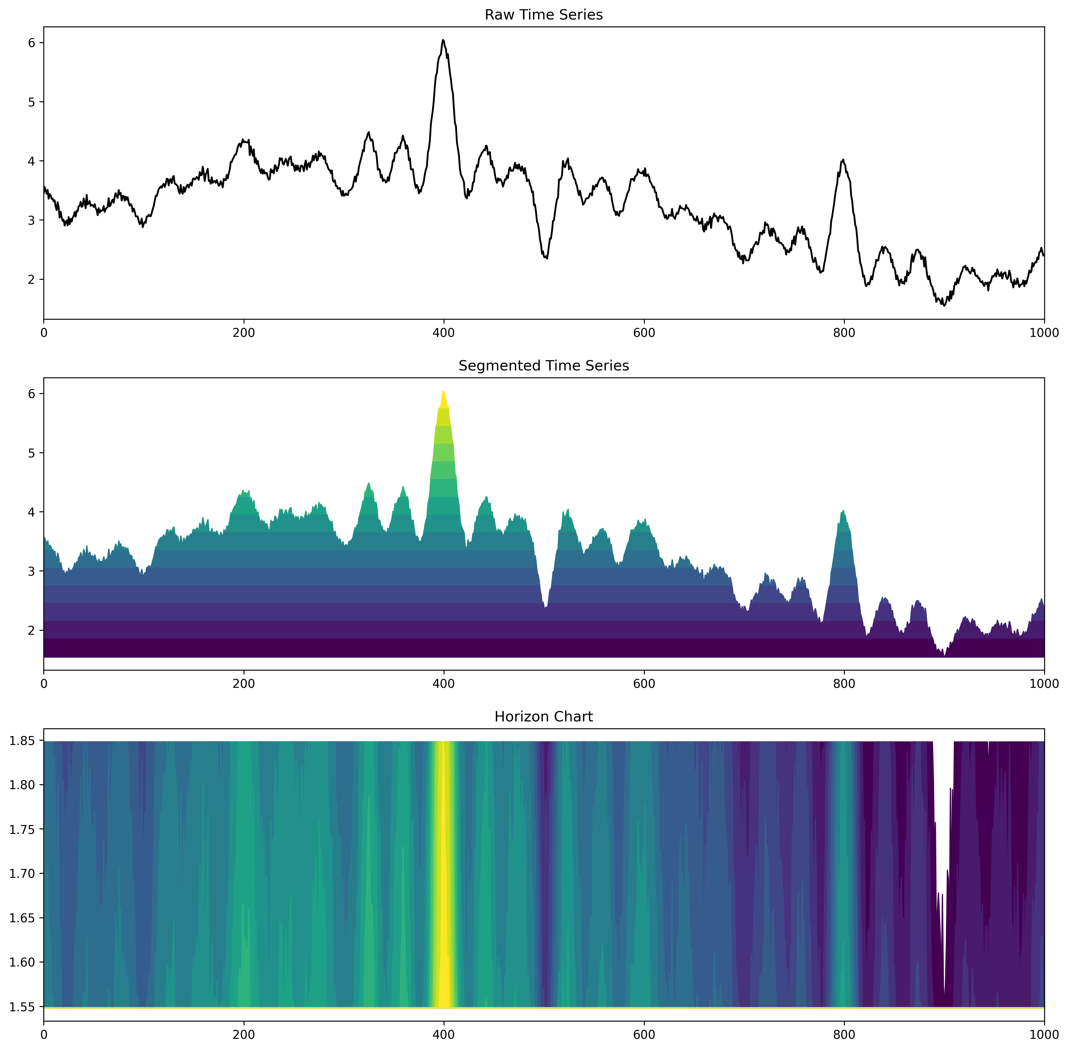
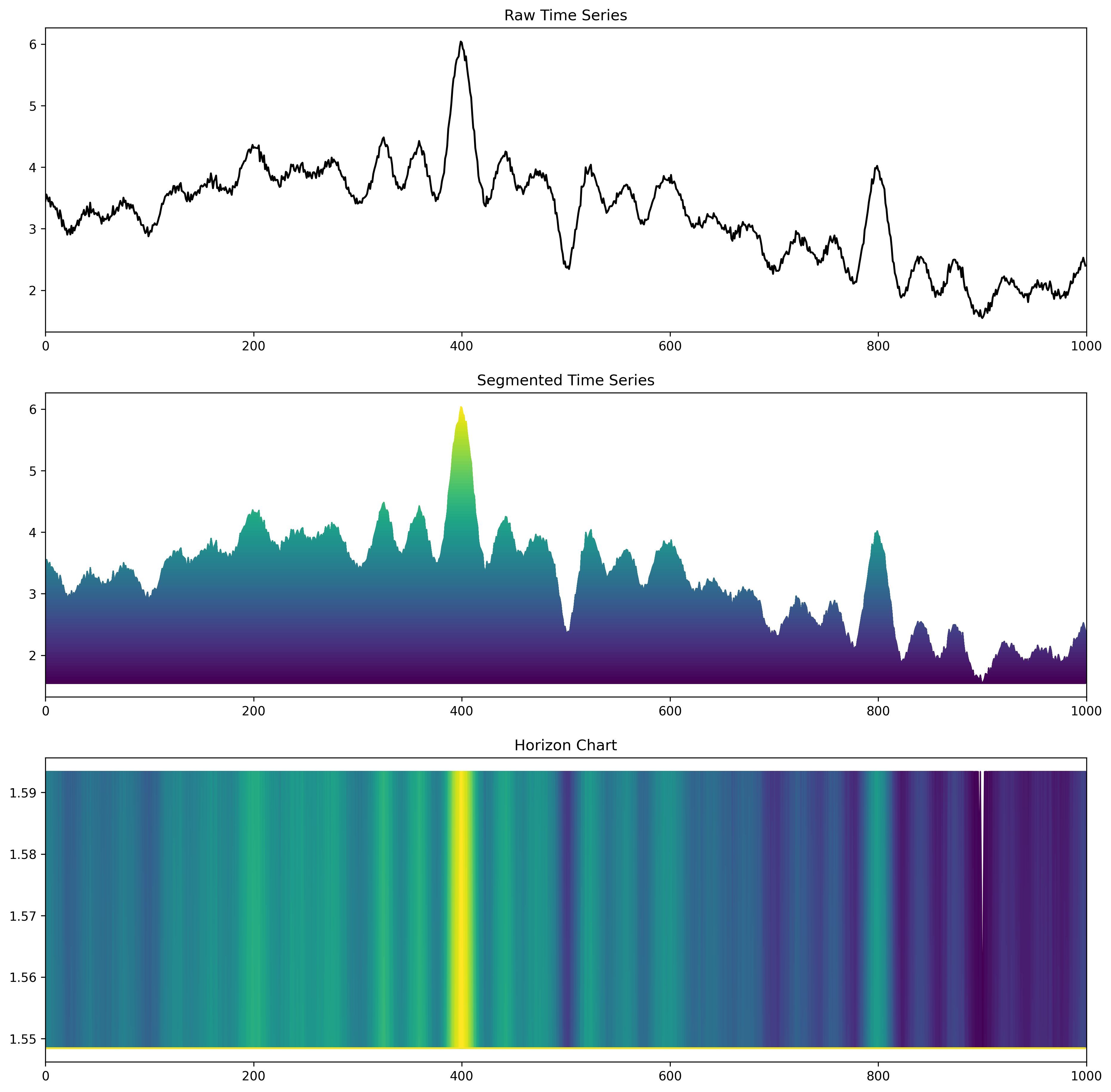
Horizon Charts (1)
- A nice way to compress line charts.
- The line chart is segmented along the y-Axis.
- Then the segments are moved to the same baseline.
- Each segment is assigned to a unique color.
- Important: The color space must allow a distinction of order!
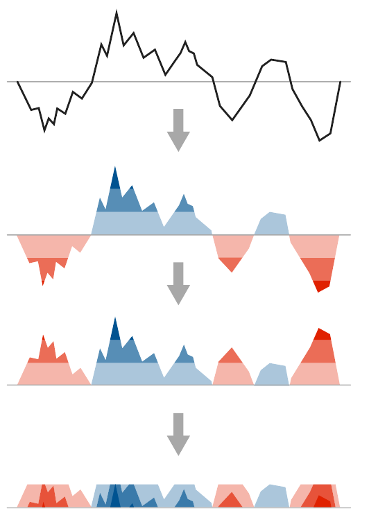
Figure source: Aigner, Miksch, Schumann, Tominski (2023, p.277), adapted from Reijner (2008).
Horizon Charts (1 segment)
Toy example by JR (🄯 2026)
Web version: Press "arrow down" to iterate through the segments.
Horizon Charts (2 segments)
Horizon Charts (3 segments)
Horizon Charts (4 segments)
Horizon Charts (5 segments)
Horizon Charts (6 segments)
Horizon Charts (7 segments)
Horizon Charts (8 segments)
Horizon Charts (9 segments)
Horizon Charts (10 segments)
Horizon Charts (11 segments)

Horizon Charts (12 segments)

Horizon Charts (13 segments)
Horizon Charts (14 segments)
Horizon Charts (15 segments)
Horizon Charts (100 segments)
Horizon Charts (500 segments)
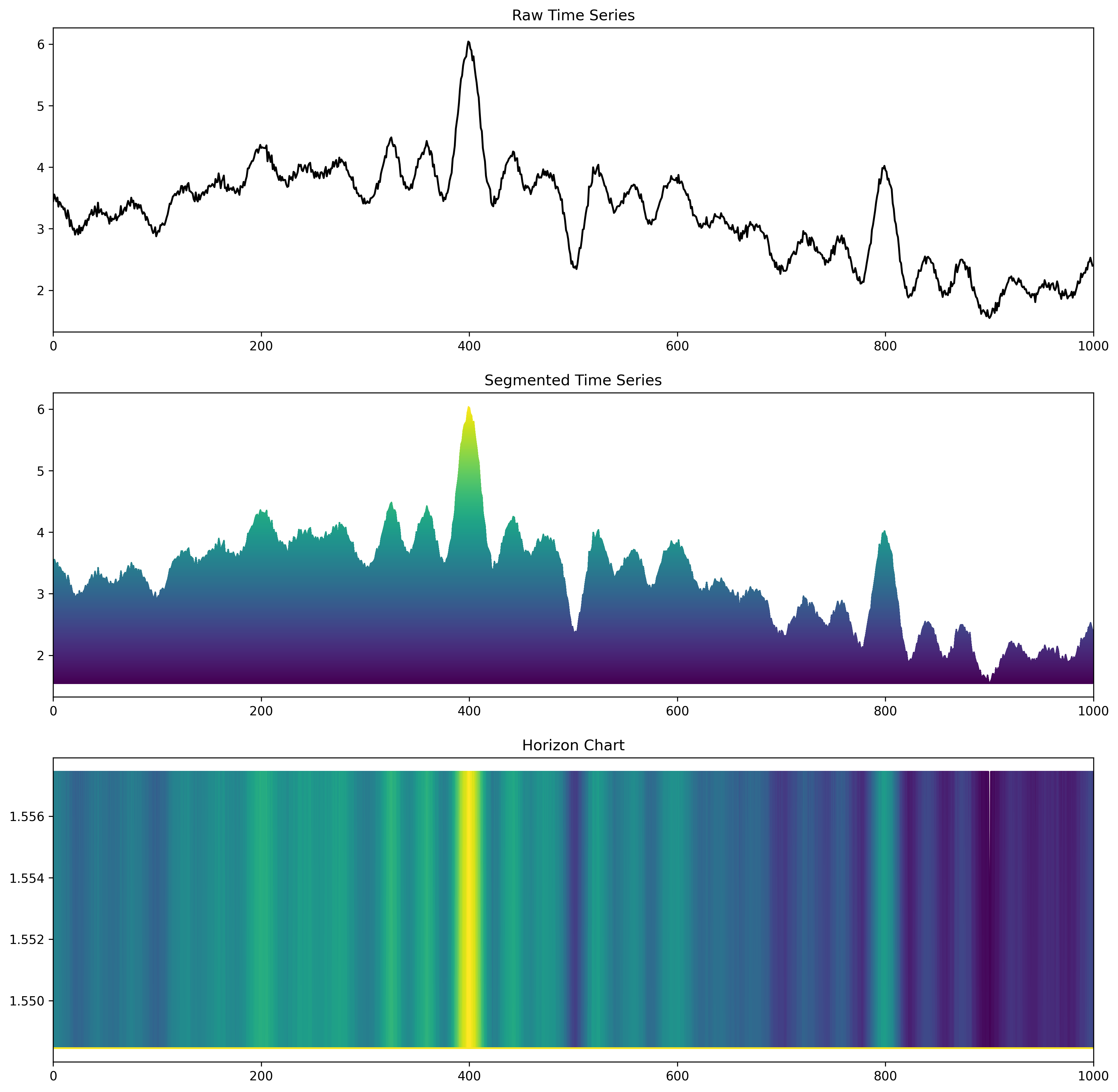
Horizon Charts (2)
The compression allows visualising a time series with many channels.
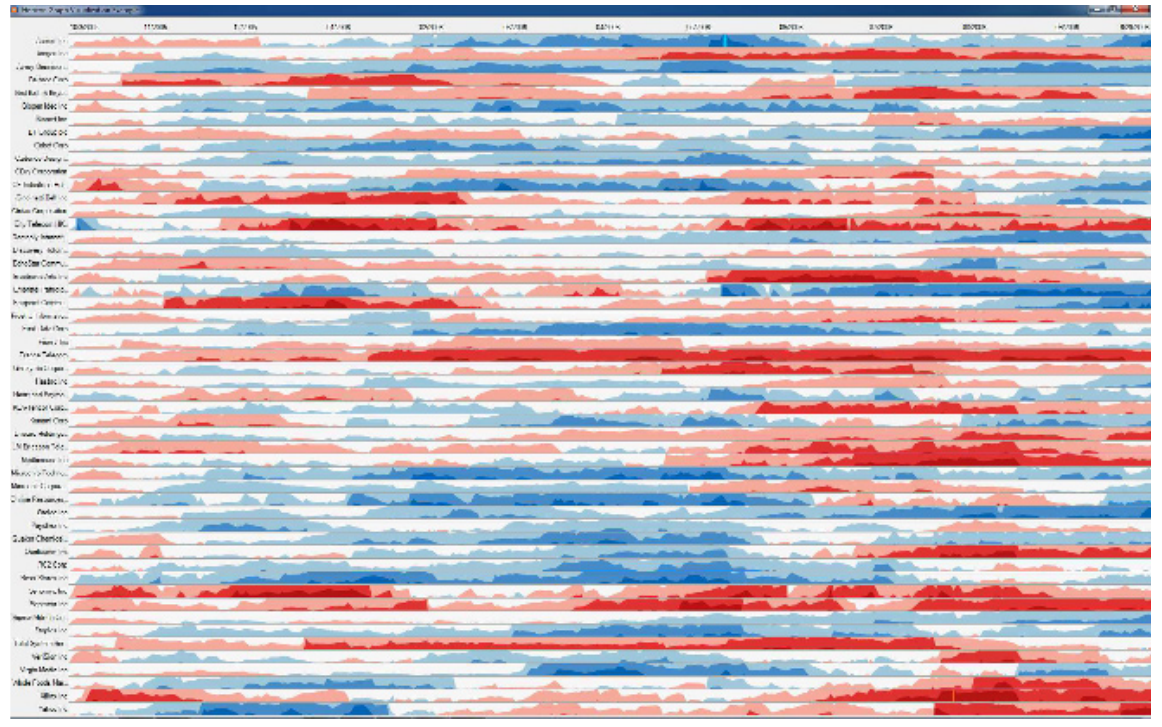
Figure source: Aigner, Miksch, Schumann, Tominski (2023, p.277), provided by Hannes Reijner.
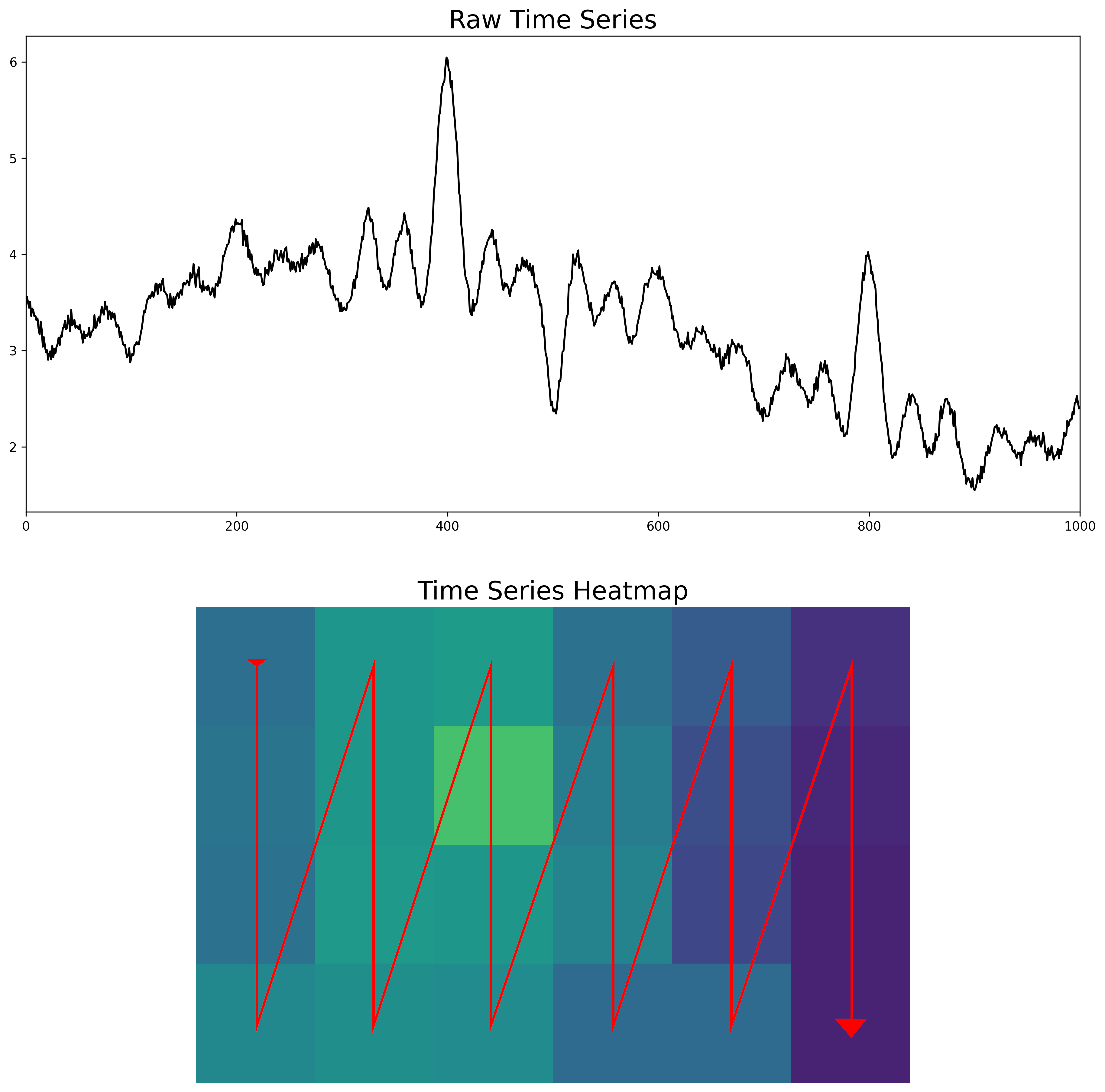
Heatmaps (1)
- An alternative compression is the heatmap.
- We scan each value of the time series and put the values in a matrix.
- The matrix follows a column-major order to preserve the time-axis in the x-direction.
- You might recognize them from GitHub (commit statistics).
🄯 JR (2026)
Heatmaps (2)
🄯 JR (2026)
Time Wheel (1)
- Sometimes we have many channels and the time axis is not in the spotlight anymore ...
- These are "parallel coordinates", but from the plot alone you would not have guessed that this is actually a time series.
- If you look carefully, the time axis is in the far left part of the chart.
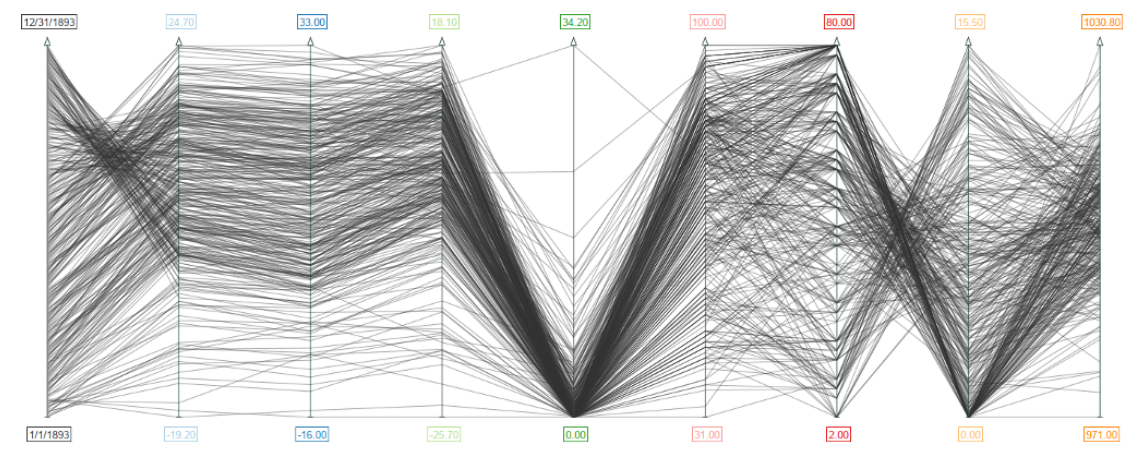
Figure source: Aigner, Miksch, Schumann, Tominski (2023, p.116).
Time Wheel (2)
- In a time wheel, the time axis is placed in the center of the chart.
- The surrounding axis correspond to the data channels of the time series.
- Each colored connecting line resembles one data value of the time series.
- That way the temporal aspect is clearly emphasized again (even though we have many variables!).
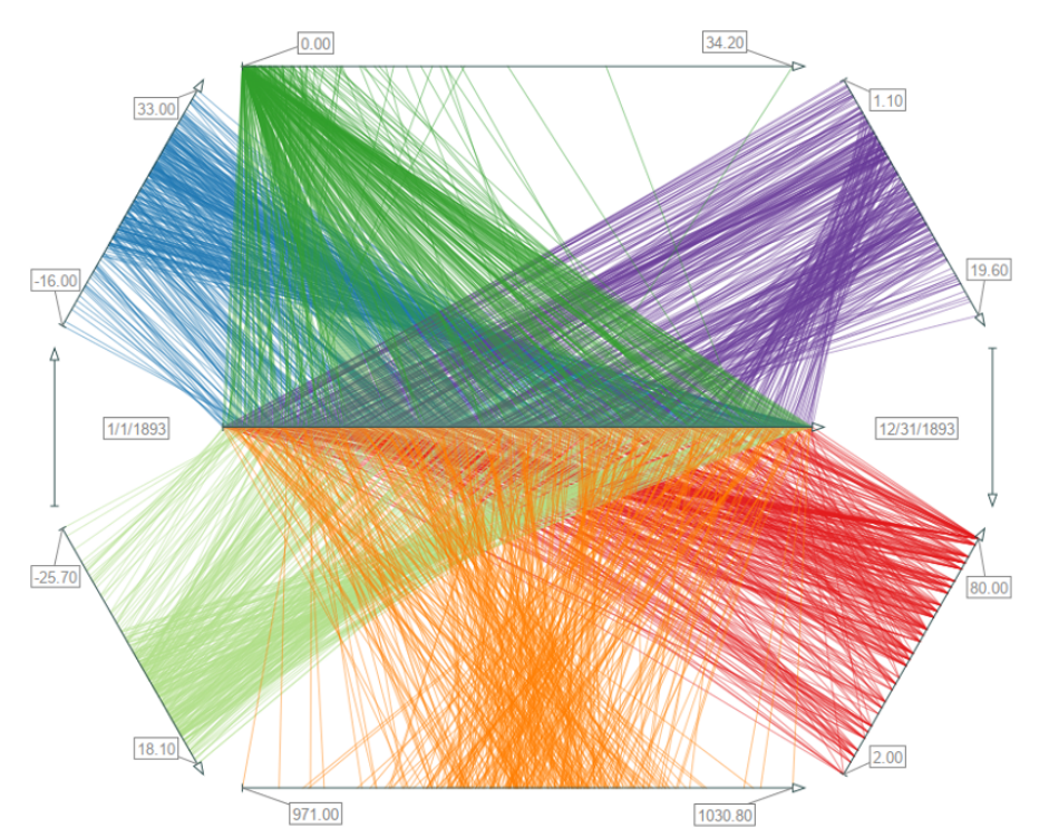
Figure source: Aigner, Miksch, Schumann, Tominski (2023, p.116).
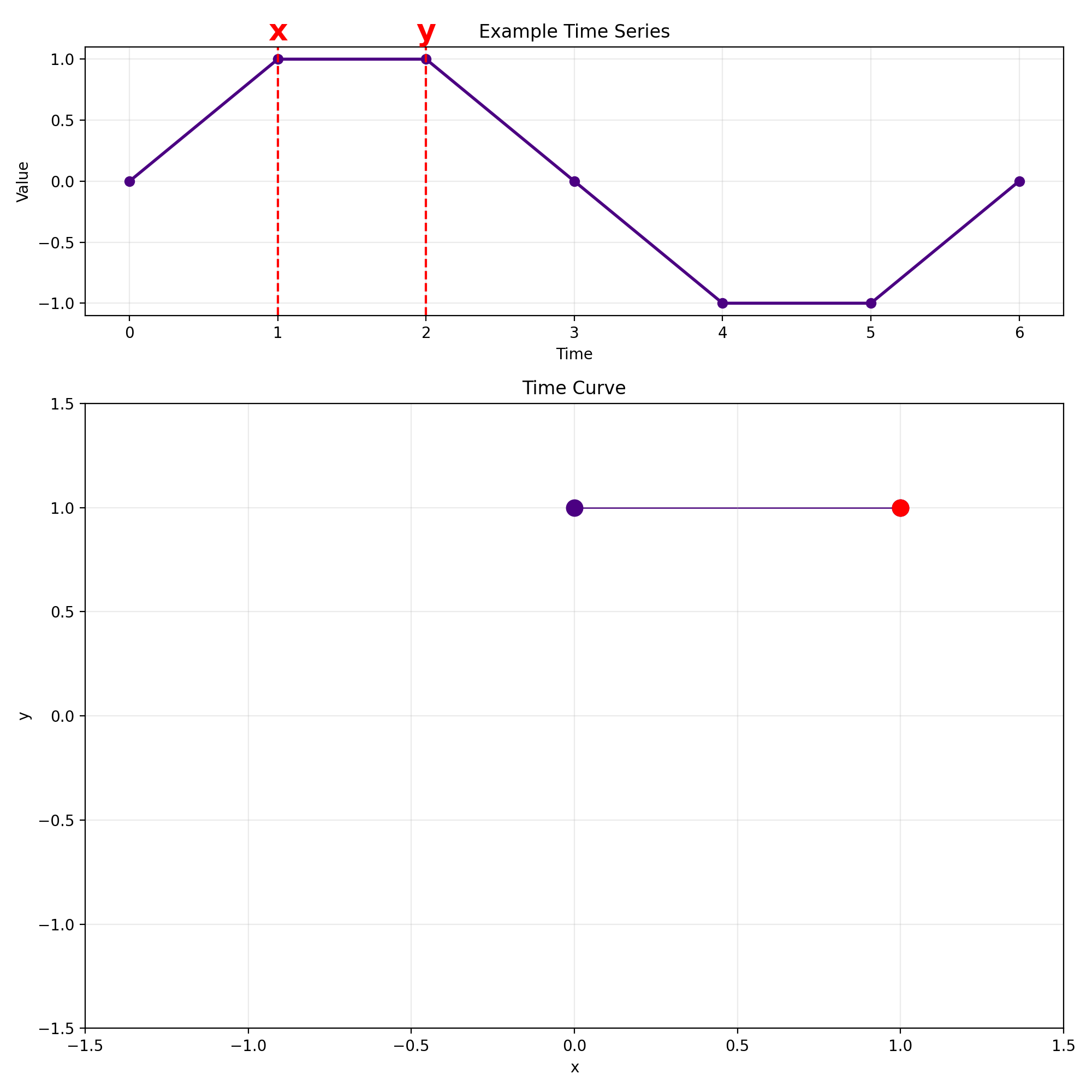
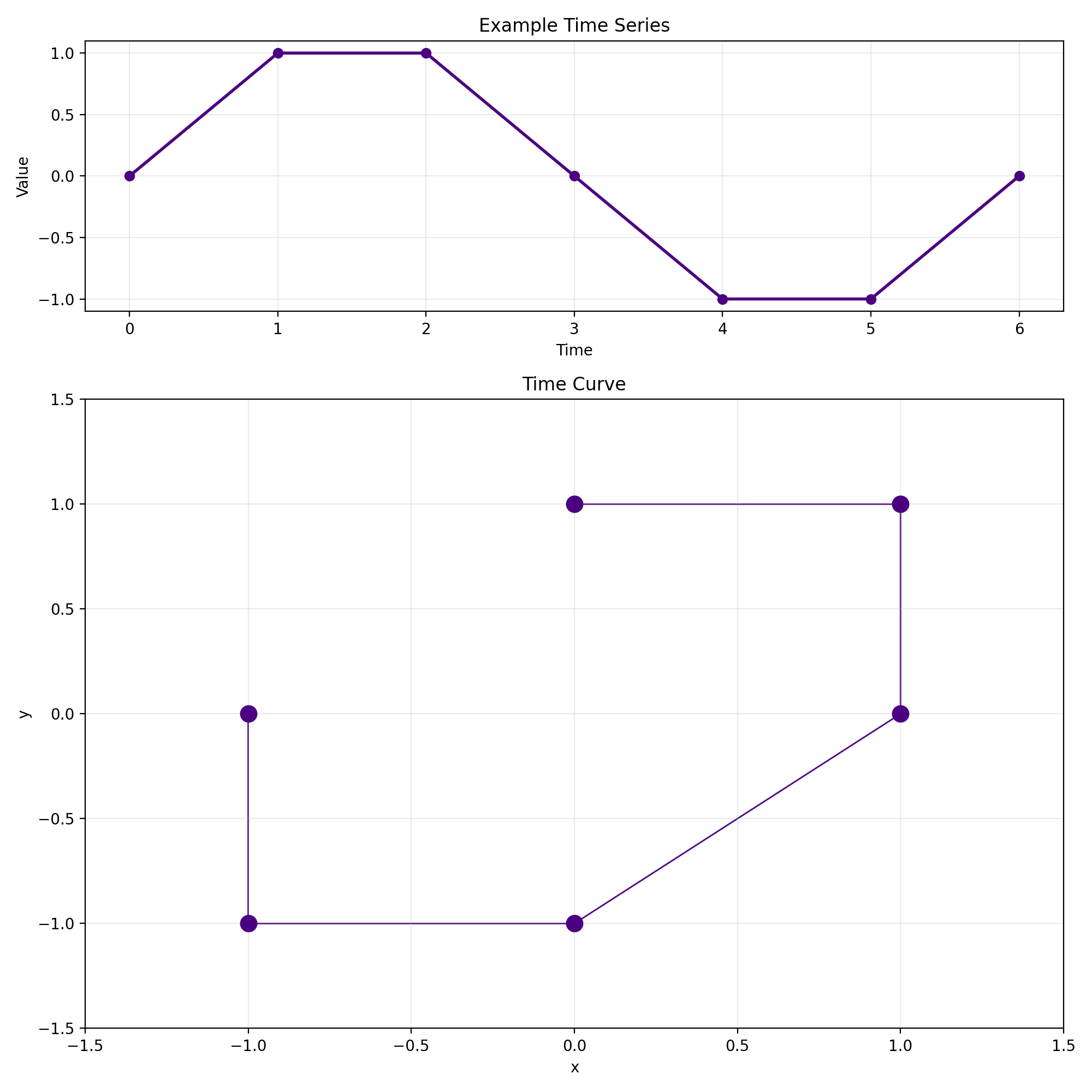
Time Curves (1)
Given a time series as follows:
$\mathbf{x} = \begin{bmatrix} 0 & 1 & 1 & 0 & -1 & -1 & 0 \end{bmatrix}$
We now transform this time series into a 2D curve
by computing a sliding window view with $w = 2$:
Each row corresponds to one window.
The first column is now treated as the x-coordinate and the second column as the y-coordinate.
That way we can now easily plot a curve in 2D.
Time Curves (2)
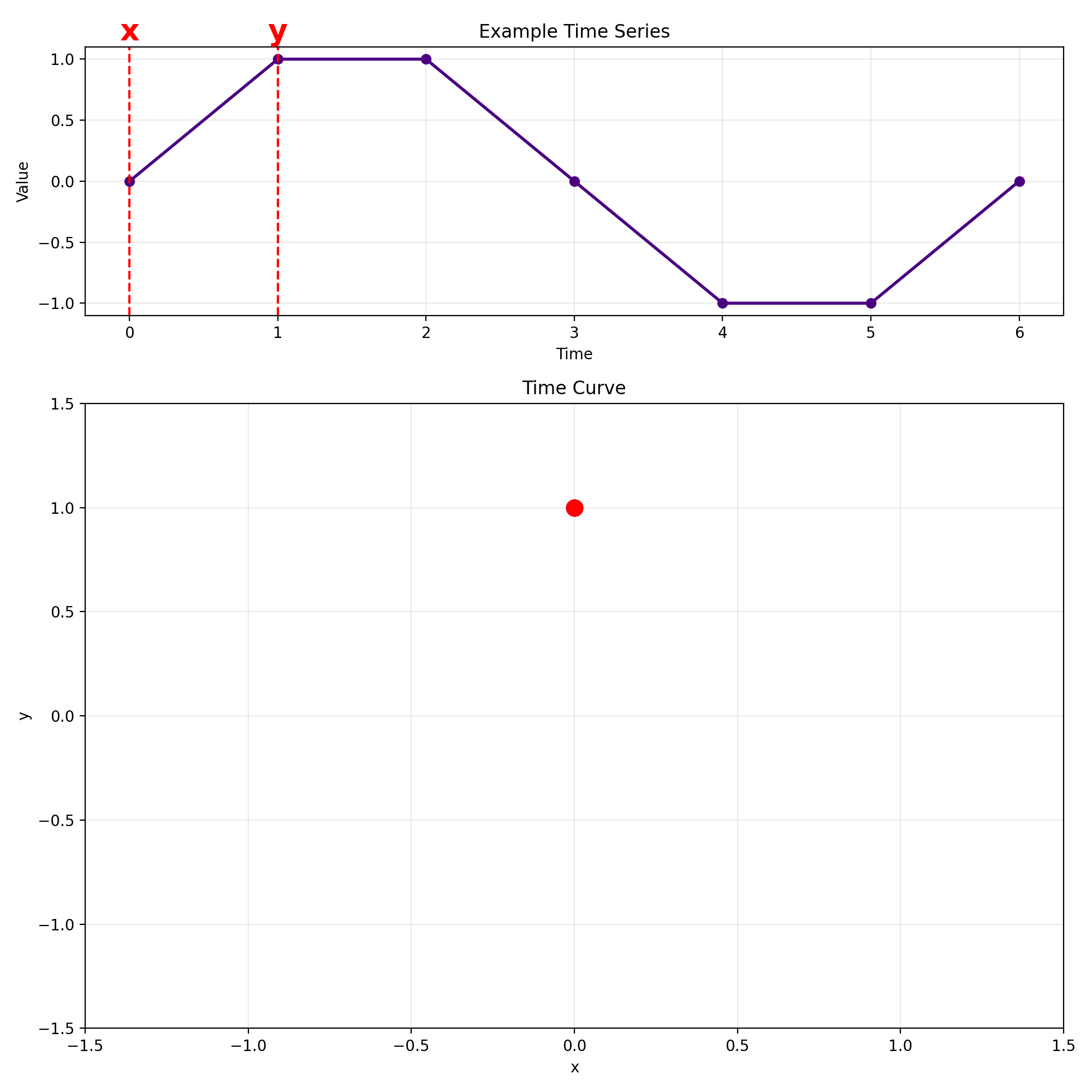
🄯 JR (2026)
Time Curves (3)
Time Curves (4)
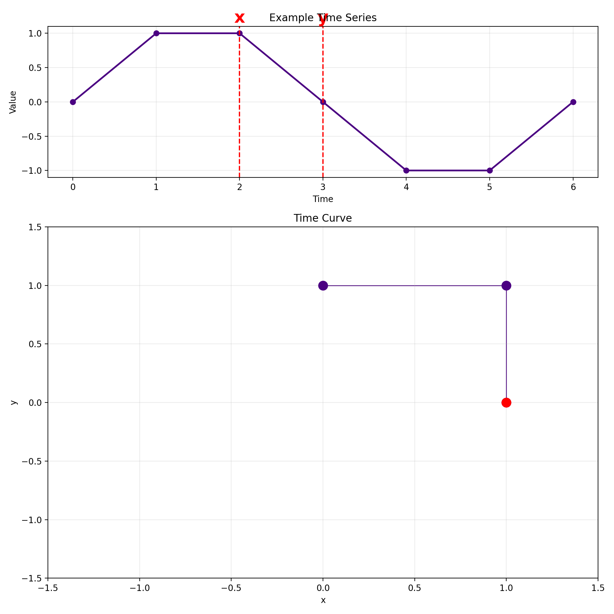
Time Curves (5)
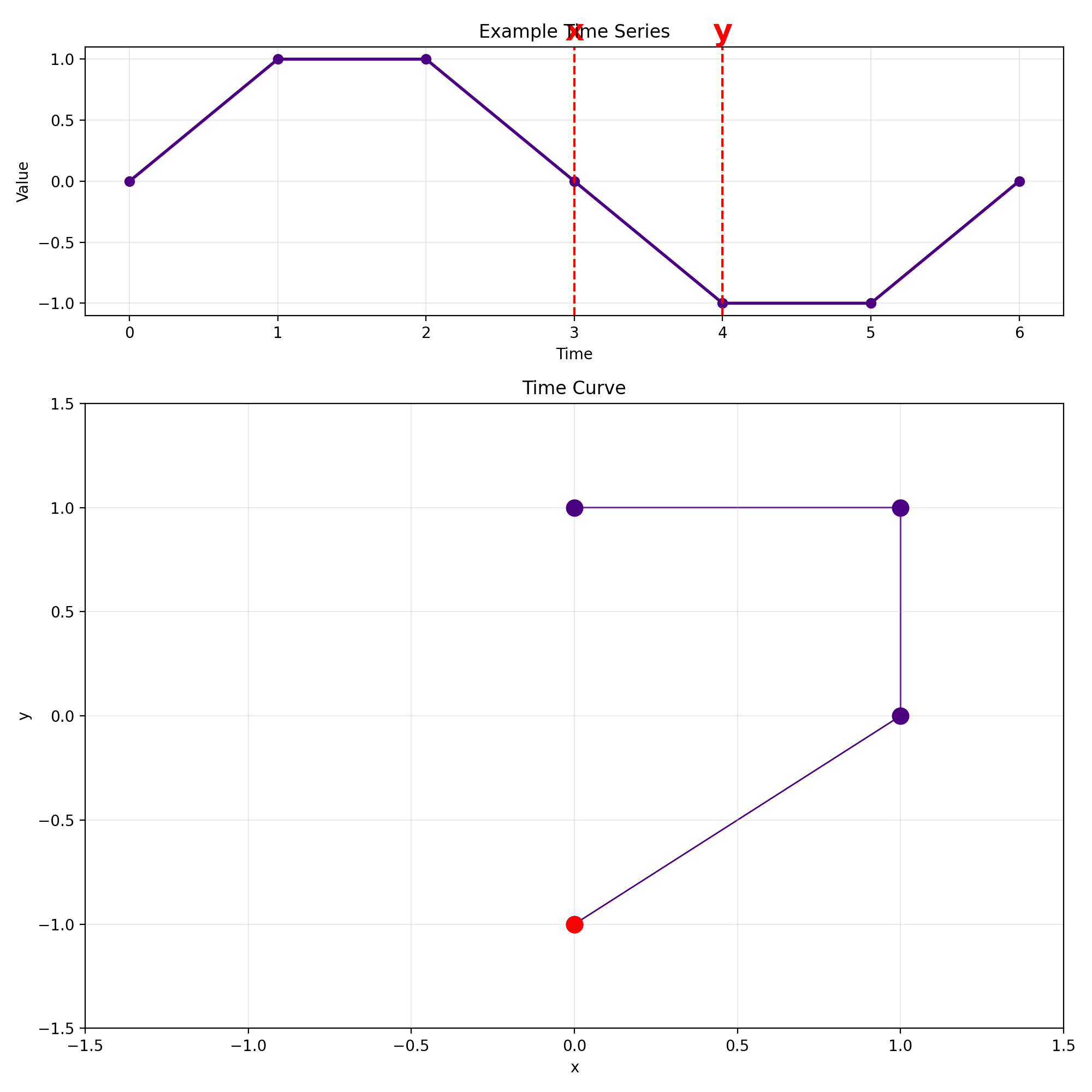
Time Curves (6)
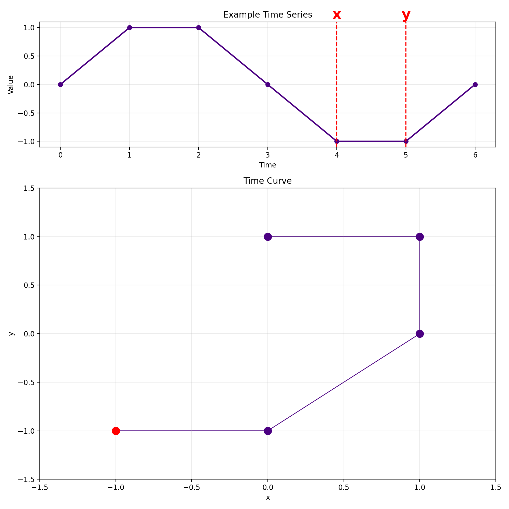
Time Curves (7)
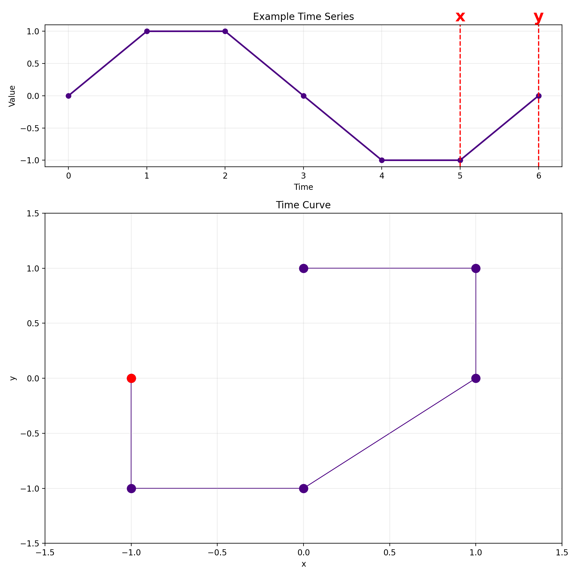
Time Curves (8)
Note: The result is not a closed curve!
Time Curves (9)
- This larger example shows a sine wave with gaussian noise.
- In general, embedding a sine wave into the 2D plane results in circular structures.
- So far we have always used $w = 2$ as the window size.
🄯 JR (2026)
Time Curves (10)
$w = 3$ yields a curve in 3D:
🄯 JR (2026)
Time Curves (11)
- How can we embed a sliding window view with $w > 3$?
- We need to apply dimensionality reduction to reduce the columns of the sliding window matrix back to two columns again.
- The approach is simple:
- Compute sliding window view with $w > 3$
- Compute distance matrix for window set (this can be either Euclidean distance, dynamic time warping, etc.).
- Supply the distance matrix to a non-linear dimensionality reduction algorithm, for example UMAP.
- The result is again plotted in the same way as before in the $w = 2$ case.
- This results in folding the timeline such that similar windows are moved closer even though their time difference might be large.
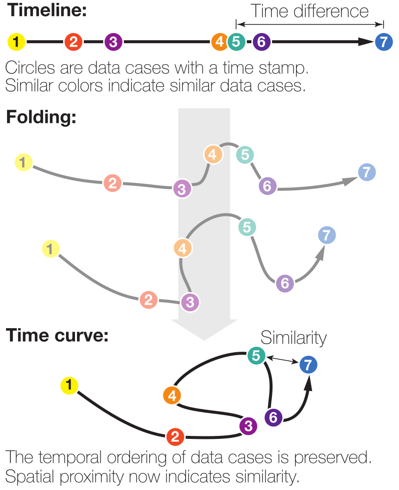
Figure source: Bach et al. (2016)
Time Curves (12)
- Example: Wikipedia pages.
- We want to analyze how the Chocolate page has evolved over time.
- Our timestamps are points in time when someone edited the page.
- Our data values are snapshots of the page.
- The difference between snapshots can be computed via the Levenshtein distance (for example).
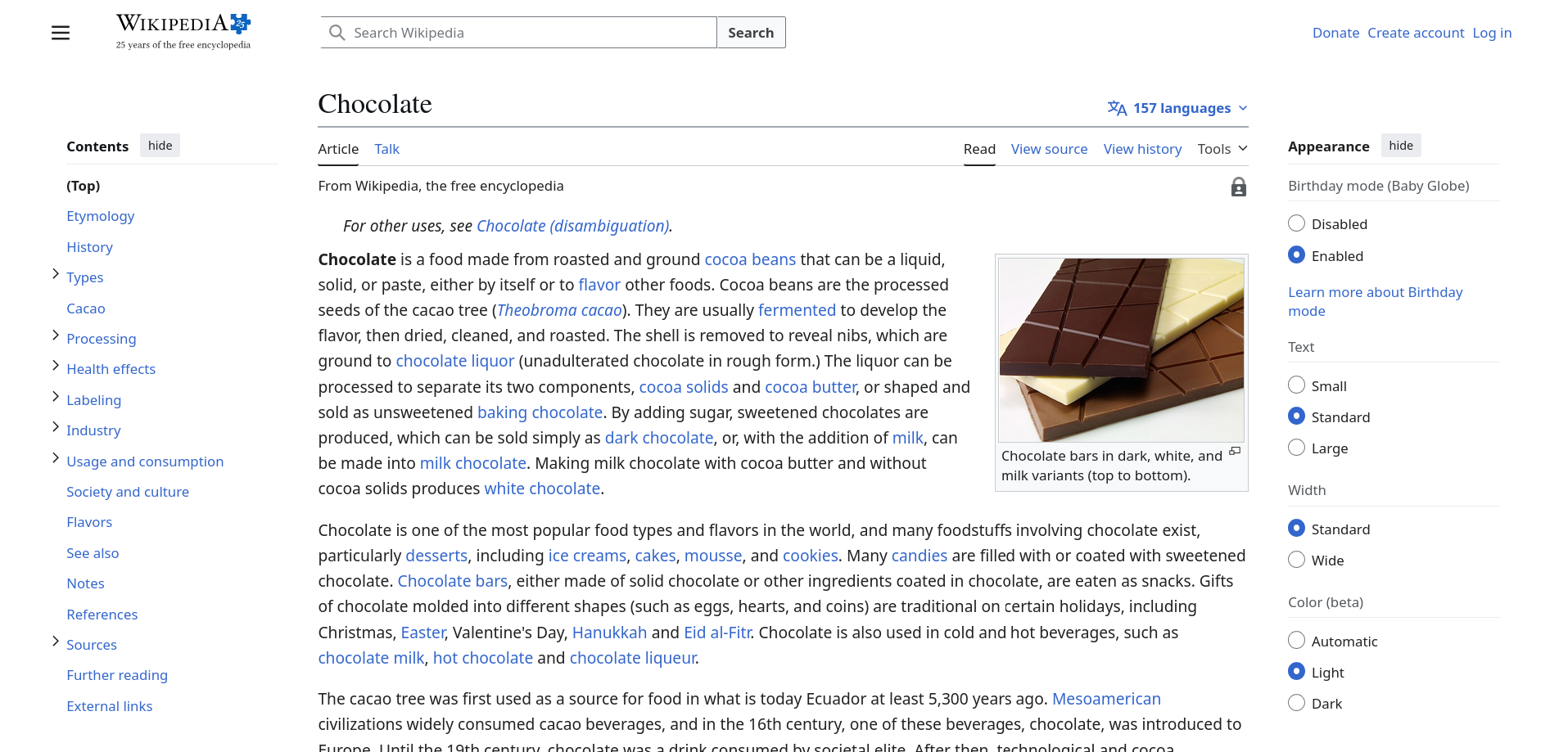
Figure source: Wikipedia Chocolate Page (02.04.2026)
Time Curves (13)
- The resulting time curve is shown on the right.
- Note how the curve oscillates between two states (marked in blue).
- This indicates an "edit war" between Wikipedia users.
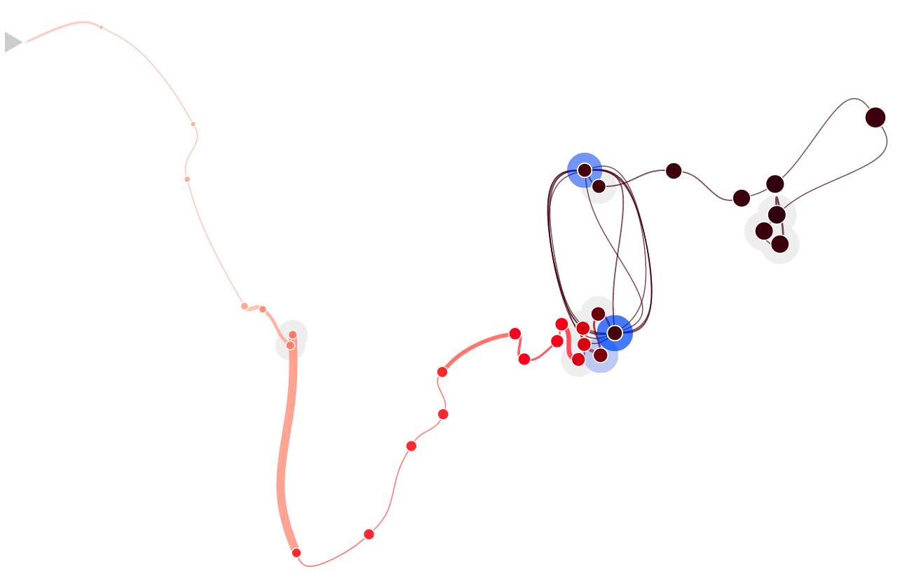
Figure source: Bach et al. (2016)
Time Curves (14)
Using time curves, patterns in time series can be identified:
Figure source: Bach et al. (2016)
Summary
Figure source: Aigner, Miksch, Schumann, Tominski (2023, p.120).
BREAK and Test Yourself!
You want to show task durations, overlaps, and deadlines in a software project.
Which fits best?
- Gantt chart
- ThemeRiver
- Time curve
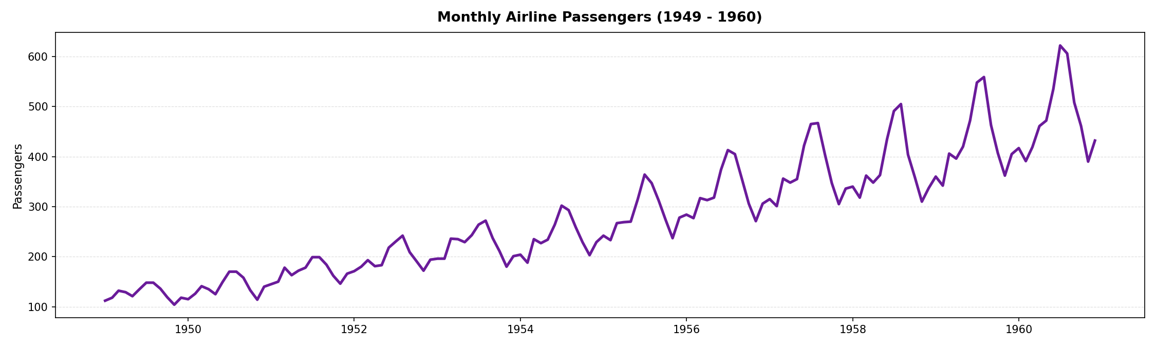
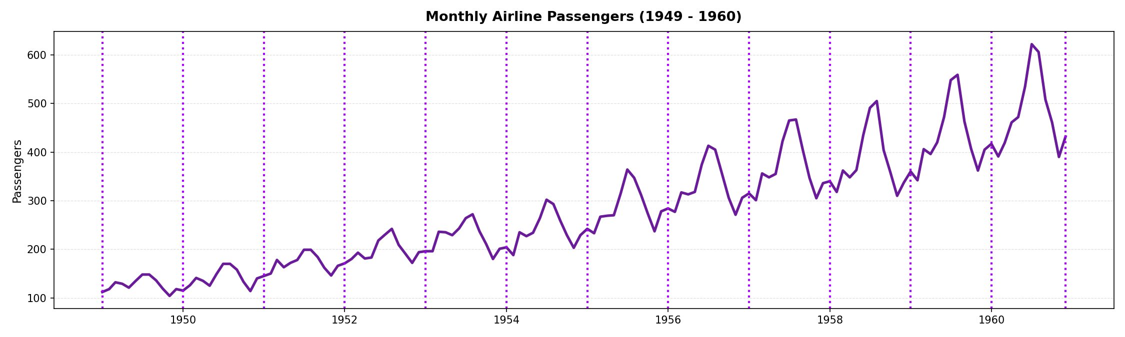
You want to compare seasonal patterns in monthly passenger counts across several years.
Which fits best?
- Standard line chart
- Spiral / polar representation
- Time curves
An instructor analyzes message activity of 80 students over time to detect bursts before deadlines while keeping the display compact.
Which fits best?
- Horizon charts
- Small multiples (10x8 line charts)
- Animated heatmap
You want users to compare relative change over time.
Which fits best?
- Superimposed raw line charts
- Indexed line charts
- Animation
Interaction Techniques
for Time Series
A graphic is not “drawn” once and for all; it is “constructed” and reconstructed until it reveals all the relationships constituted by the interplay of the data. The best graphic operations are those carried out by the decision-maker himself.
Bertin (1981)
Why Interaction? (1)
- Challenges:
- Users are only able to digest a fraction of the available information at a time.
- Encoding all facets of a complex time-oriented dataset into a single visual representation will lead to overloaded visualization.
- Solution:
- Big problem has to be split into smaller pieces.
- Focus on relevant data aspects and particular tasks per visual representation.
- Visually accessing and mentally combining pieces via interaction.
Why Interaction? (2)
Visual Information Seeking Mantra by Shneiderman (1996)
“Overview first, zoom and filter, then details-on-demand.”
What motivates a user to interact?
Implementing interaction techniques to support these intents allows taking full advantage of the synergy of the human's skills in creative problem-solving and the machine’s computational capabilities.
The Interaction Loop
Goal: Keep interaction costs low!
- Costs can be physical or mental.
- Execution side:
- Make interactions easy to discover.
- Avoid long pointer movements.
- Evaluation side:
- Let visual response stand out.
- Users must understand effect of interaction.
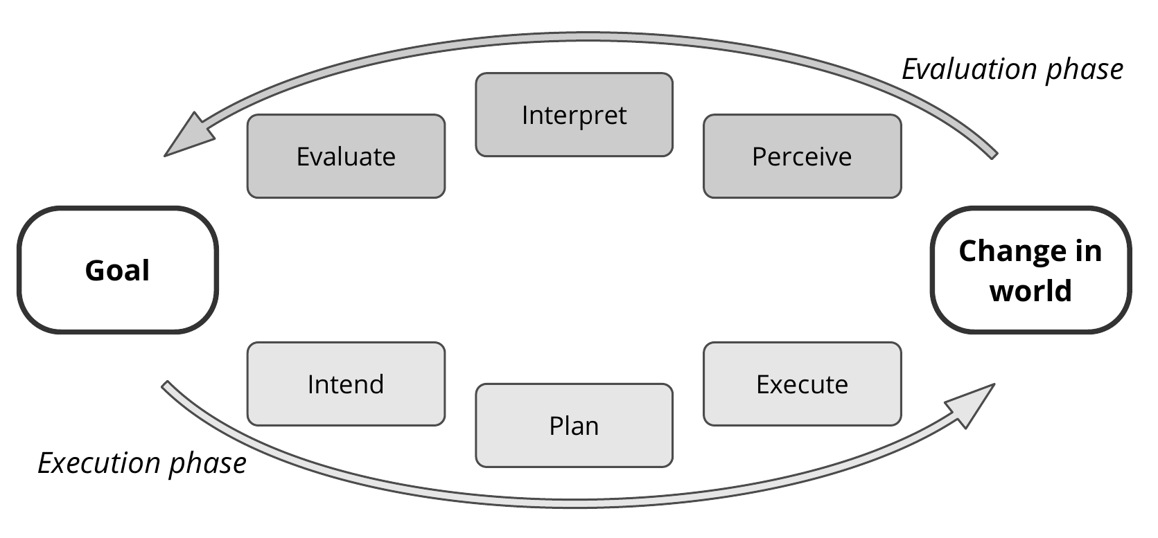
Figure source: Aigner, Miksch, Schumann, Tominski (2023, p.133), adapted from Norman (2013).
Modes of Interaction (1)
Stepped Interaction: Discrete Changes
🄯 JR (2026), recorded from spirale.rakuschek.at
Modes of Interaction (2)
Continuous Interaction: Many changes in short time (appearing as fluent change)
🄯 JR (2026), recorded from EnhancedSpiral.js @ Uni Rostock
Navigating Time (1)
- Time series often too long for a single screen.
- Users need to select subsets for detail inspection.
- Commonly done through sliders.

Figure source: Aigner, Miksch, Schumann, Tominski (2023, p.141), adapted from Tominski and Schumann (2020).
Navigating Time (2)
🄯 JR (2026), recorded from EnhancedSpiral.js @ Uni Rostock
The handles of the slider are moved to select the subset.
Navigating Time (3)
🄯 JR (2026), recorded from EnhancedSpiral.js @ Uni Rostock
The selection can also be moved all at once if the interval size needs to remain constant.
Navigating Time (4)
🄯 JR (2026), recorded from EnhancedSpiral.js @ Uni Rostock
A second slider is used to provide fine selection if the time span is large.
Navigating Time (5)
🄯 JR (2026)
Spiral specific: Subsets within cycles can be selected through a Guidance Donut.
Navigating Time (6)
Very common interaction technique:
Subset selection via zooming and panning.
🄯 JR (2026)
Direct Manipulation (1)
Users drag the slider in the timeline to adjust the current temporal snapshot:
🄯 JR (2026), recorded from DimpVis @ Ontario Tech University
Direct Manipulation (2)
Users can drag a data point to directly adjust the time point.
🄯 JR (2026), recorded from DimpVis @ Ontario Tech University
Direct Manipulation (3)
TimeWheel: Overview+Detail Axis
🄯 JR (2026), recorded from TimeWheel software kindly provided by C. Tominski
Direct Manipulation (4)
TimeWheel: Focus+Context Axis
🄯 JR (2026), recorded from TimeWheel software kindly provided by C. Tominski
Semantic Zooming (1)
By zooming into the small multiples view, the number of bands in the horizon charts are reduced, revealing more details.
🄯 JR (2026)
Semantic Zooming (2)
In the case of heatmaps, the resolution is increased when zooming into the view.
🄯 JR (2026)
Semantic Zooming (3)
- Seamless level-of-detail control
- The resolution adapts based on the number of cells visible in the small multiples view.
- The objective is to provide increasing levels of detail at higher zoom levels.
- At lower zoom levels, simplified representations are used to convey an overview.
- Recall Shneiderman’s mantra: "Overview first, details on demand."
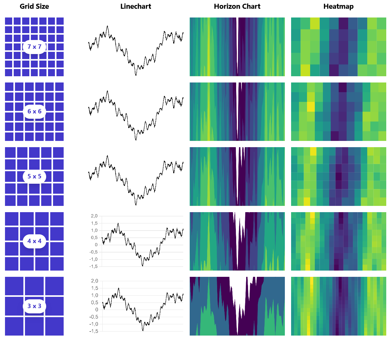
Figure source: Rakuschek et al. (2025)
Queries (1)
- Often we need to filter a time series dataset.
- Queries can be used to retrieve a subset of time series from the dataset.
- An example of an interactive query is the TimeBox (right side).
- Users define a rectangular selection: only time series whose values fall within the specified range during the selected time interval are retrieved.
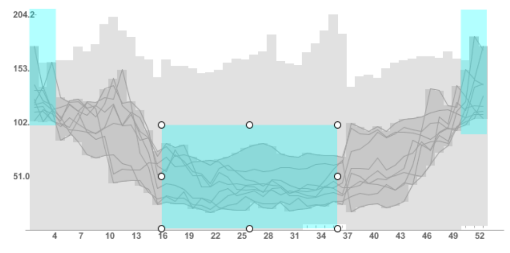
Figure source: Aigner, Miksch, Schumann, Tominski (2023, p.146).
Queries (2)
- An alternative query technique is sketching.
- Users already have a mental model of their information need.
- The query is a time series representative sketched in an editor.
- The system then retrieves intervals which are most similar to the sketched time series.
Video kindly provided by professor Jürgen Bernard.
Summary
- Stepped and continuous interaction modes.
- Zooming and panning for navigating time.
- Sliders for selecting time intervals.
- Direct manipulation of data points and axes.
- Semantic zooming for level-of-detail control.
- TimeBox queries for range-based filtering.
- Sketch-based queries for pattern search.
Further Fundamental Techniques
This final chapter covers further fundamental primitives to visualize time series which were not covered in the previous chapters.
Arc Diagrams
Arrangement: Linear
Frame of reference: abstract
Dimensionality: 2D
- Identify repeated subsequences within a data sequence.
- Place the sequence linearly along a horizontal (time) axis.
- Connect repeated occurrences with arcs.
- Encode properties: thickness = subsequence length, height = distance between occurrences.
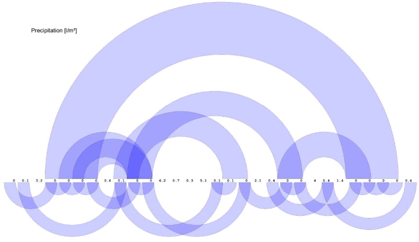
Figure source: Aigner, Miksch, Schumann, Tominski (2023, p.239), provided by Michael Zornow.
Growth Matrix
Arrangement: Linear
Frame of reference: abstract
Dimensionality: 2D
- Compute asset return rates for all possible time subintervals
- Map results into a matrix/triangle where the axes encode buy/sell time or holding period
- Encode performance with normalized colors: green for gains, red for losses
- Use dense heatmap-style matrices to support compact comparison across assets or against benchmarks
- Extend the method with rectangular performance matrices and 2D color maps to show both intra- and inter-asset performance
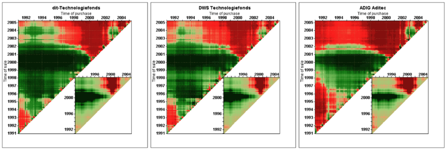
Figure source: Aigner, Miksch, Schumann, Tominski (2023, p.241), after Keim et al. (2006).
Multi-Resolution Visualization of Time Series
Arrangement: Linear
Frame of reference: abstract
Dimensionality: 2D
- Bin the time series into segments and assign each a degree-of-interest (DoI) score
- Optionally merge neighboring bins with similar DoI values
- Map DoI to visual resolution: high DoI → larger cells, low DoI → smaller cells
- Allocate more display space to important data and compress less relevant parts
- Render as a multi-resolution visualization (e.g., matrix heatmap), applicable to other time-based views
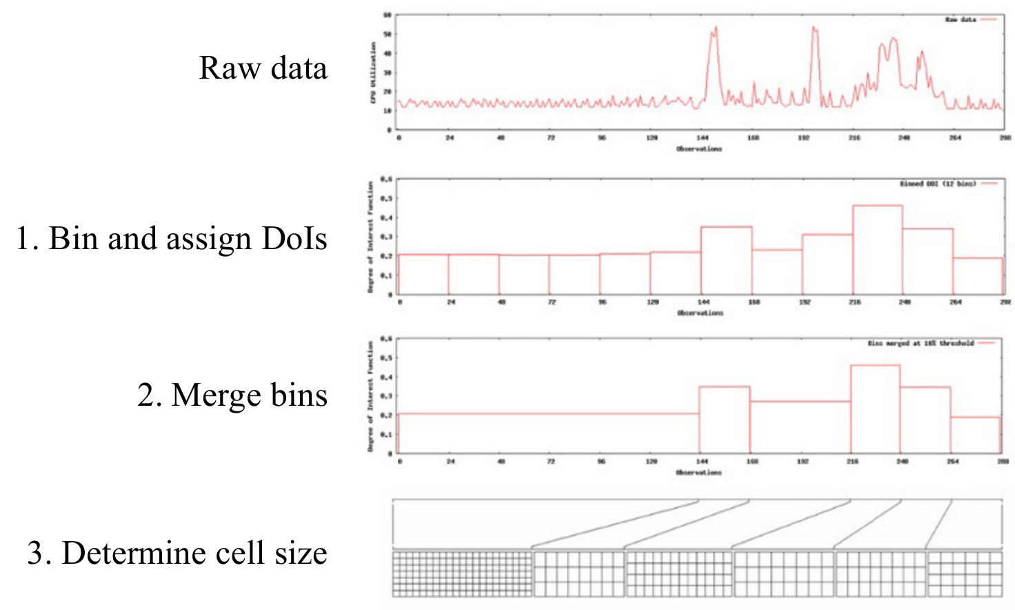
Figure source: Aigner, Miksch, Schumann, Tominski (2023, p.242), provided by the emperor of Visual Analytics: Tobias Schreck.
Pinus View / Triangular Model
Arrangement: Linear
Frame of reference: abstract
Dimensionality: 2D
- Compute statistical measures for all combinations of time scales and interval start positions
- Organize results in a matrix where axes represent time scale and starting point
- Use color/visual encoding to highlight potentially interesting patterns
- Enable interactive exploration to inspect and analyze detected patterns
- Apply the approach to identify patterns in time series (e.g., environmental data)
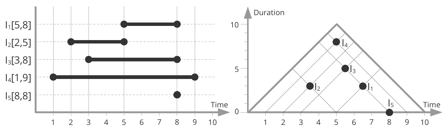
Figure source: Aigner, Miksch, Schumann, Tominski (2023, p.267), adapted from Qiang et al. (2012).
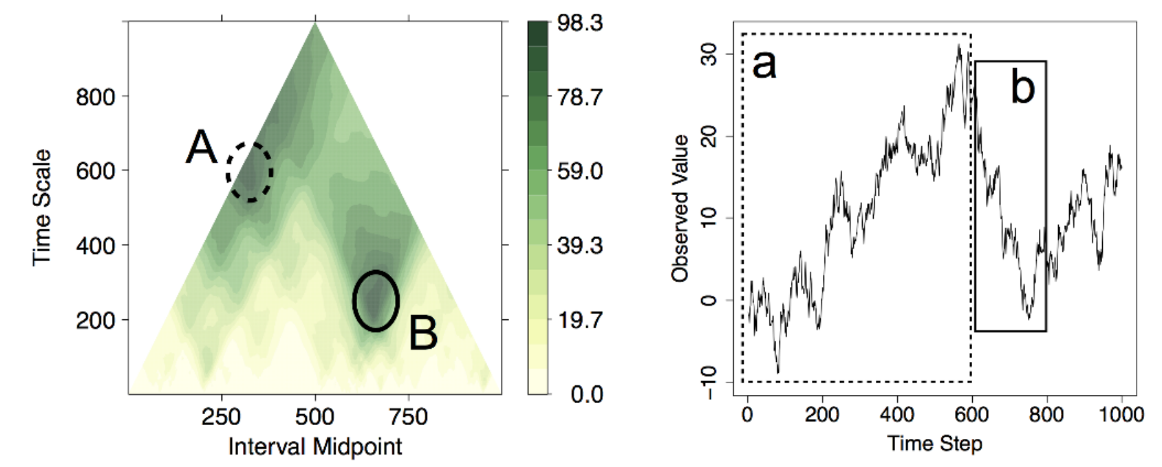
Figure source: Aigner, Miksch, Schumann, Tominski (2023, p.243), after Sips et al. (2012).
Cluster Calendar
Arrangement: Cyclic
Frame of reference: abstract
Dimensionality: 2D
- Represent each day as a 24-hour line plot of the measured values
- Cluster similar daily patterns and compute an average (representative) per cluster
- Map cluster membership onto a calendar using color coding
- Allow adjustable cluster granularity and compare individual vs. aggregated patterns
Figure source: Aigner, Miksch, Schumann, Tominski (2023, p.273), after van Wijk and van Selow (1999).
ClockMap
Arrangement: Cyclic
Frame of reference: abstract
Dimensionality: 2D
- Represent hierarchy using a circular treemap layout (nested, space-filling structure)
- Encode each node as a circular glyph (“clockeye”) showing its time series
- Map time around the circle (like a clock) and use color along radial lines for values
- Size glyphs by hierarchy structure (number of contained items), not data values
- Support exploration via interaction (drill-down, semantic zoom, details-on-demand)
Figure source: Aigner, Miksch, Schumann, Tominski (2023, p.275), after Fabian Fischer ff.cx/clockmap.
Recursive Patterns
Arrangement: Linear, Cyclic
Frame of reference: abstract
Dimensionality: 2D
- Map each data value to a single pixel with color encoding
- Group pixels into small blocks representing the lowest time unit (e.g., day)
- Recursively arrange these blocks to form higher time levels (week, month, year)
- Align layout with natural temporal hierarchy to preserve structure
- Combine multiple pixel displays for compact overviews of large (multi-variate) time series
Figure source: Aigner, Miksch, Schumann, Tominski (2023, p.275), after Keim et al. (1995).
Stacked Graphs
Arrangement: Linear
Frame of reference: abstract
Dimensionality: 2D
- Encode each variable as a layer with height representing its value over time
- Stack layers along a shared time axis to show combined evolution
- Use color to distinguish layers and optionally encode additional variables
- Vary layout and ordering of layers (e.g., streamgraph, ThemeRiver, traditional stacking)
- Interpret overall shape as aggregate trend while tracking individual layer contributions
Figure source: Aigner, Miksch, Schumann, Tominski (2023, p.286).
Connected Scatterplots
Arrangement: Linear
Frame of reference: abstract
Dimensionality: 2D
- Map two time-dependent variables to x- and y-axes (like a scatterplot)
- Plot points for each time step and connect them in temporal order
- Show sequence using lines/arrows (order visible, exact time gaps not)
- Reveal relationships and trajectories between variables over time
- Improve readability with cues for time direction (e.g., arrows, annotations)
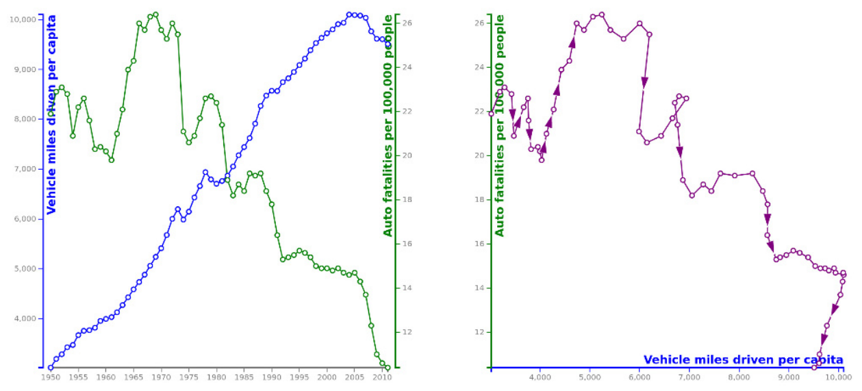
Figure source: Aigner, Miksch, Schumann, Tominski (2023, p.304).
Line Density Plot
Arrangement: Linear
Frame of reference: abstract
Dimensionality: 2D
- Discretize the plot into a grid by binning time and value axes
- Map each time series as a virtual polyline, marking grid cells it passes through
- Accumulate counts per cell across all time series
- Normalize values (e.g., per column) to obtain comparable densities
- Encode density with color to reveal trends and concentration of values
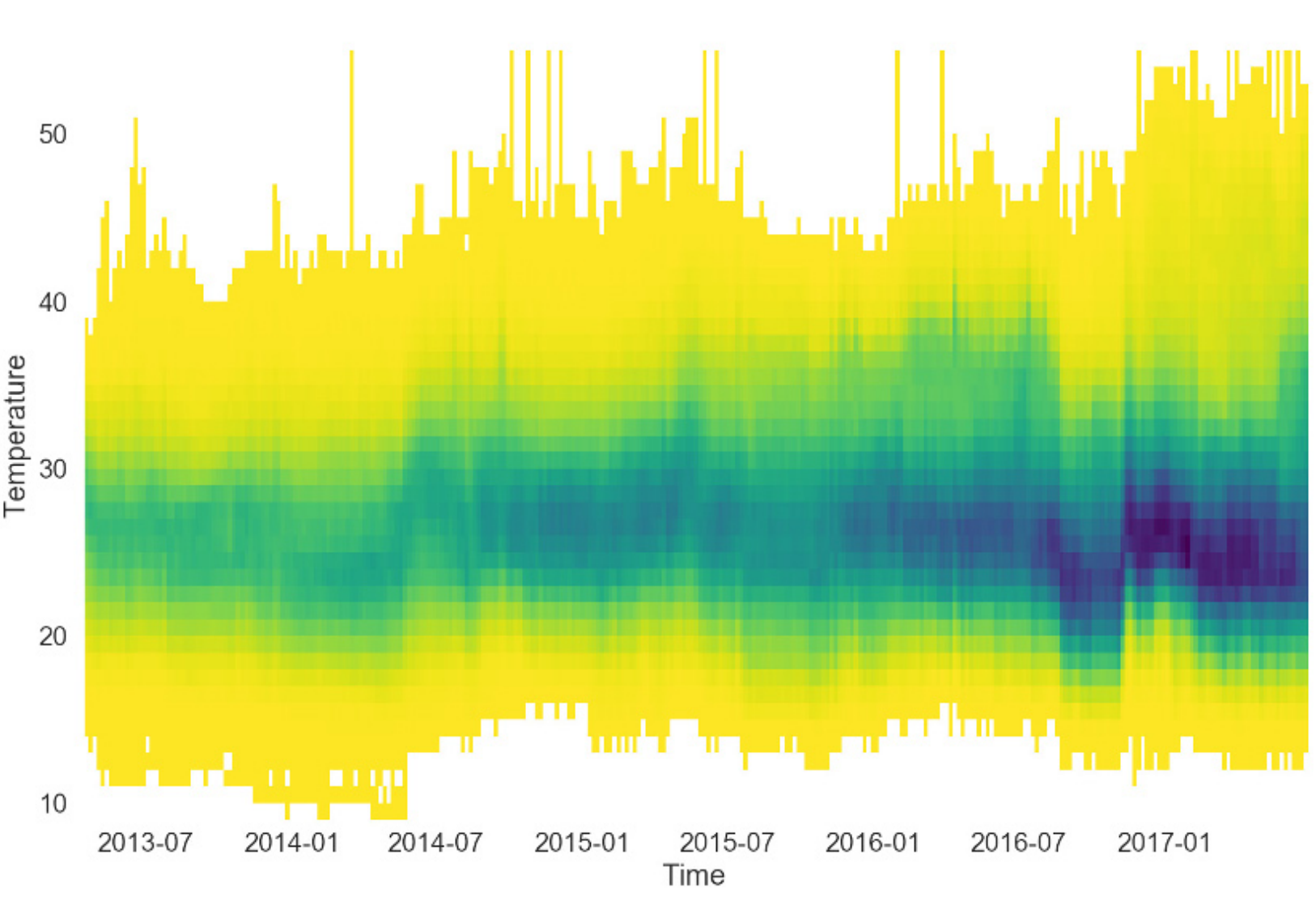
Figure source: Aigner, Miksch, Schumann, Tominski (2023, p.307), provided by Dominik Moritz.
Sankey Diagram, Alluvial Diagram
Arrangement: Linear
Frame of reference: abstract
Dimensionality: 2D
- Represent flows between nodes/stages using directed links
- Encode flow quantity by the width of links/arrows
- Arrange nodes sequentially to reflect stepwise (ordinal) progression over time
- Optionally use color to encode additional attributes (e.g., direction, categories)
- Extend to variants (e.g., alluvial diagrams) to show structural changes over time
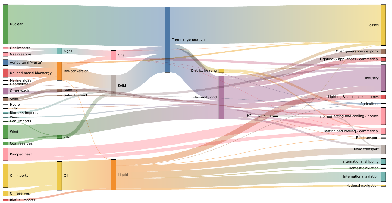
Figure source: Aigner, Miksch, Schumann, Tominski (2023, p.313).
So much to see, so much to do!
All techniques can be interactively browsed and filtered in the TimeViz Browser.
The End
After over 150 slides, it turns out that there is a little bit more
to the visualization of time series than simple line charts.
JR